
3D Hover Monster Cards
Interactive fantasy cards that tilt toward the floor on hover while unique monster characters rise above them with glowing 3D depth effects.
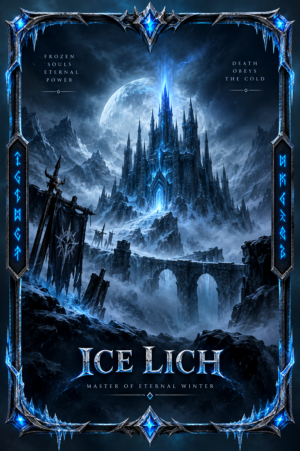
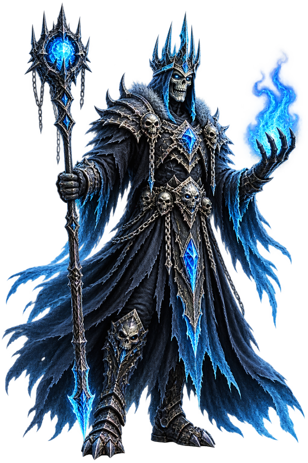
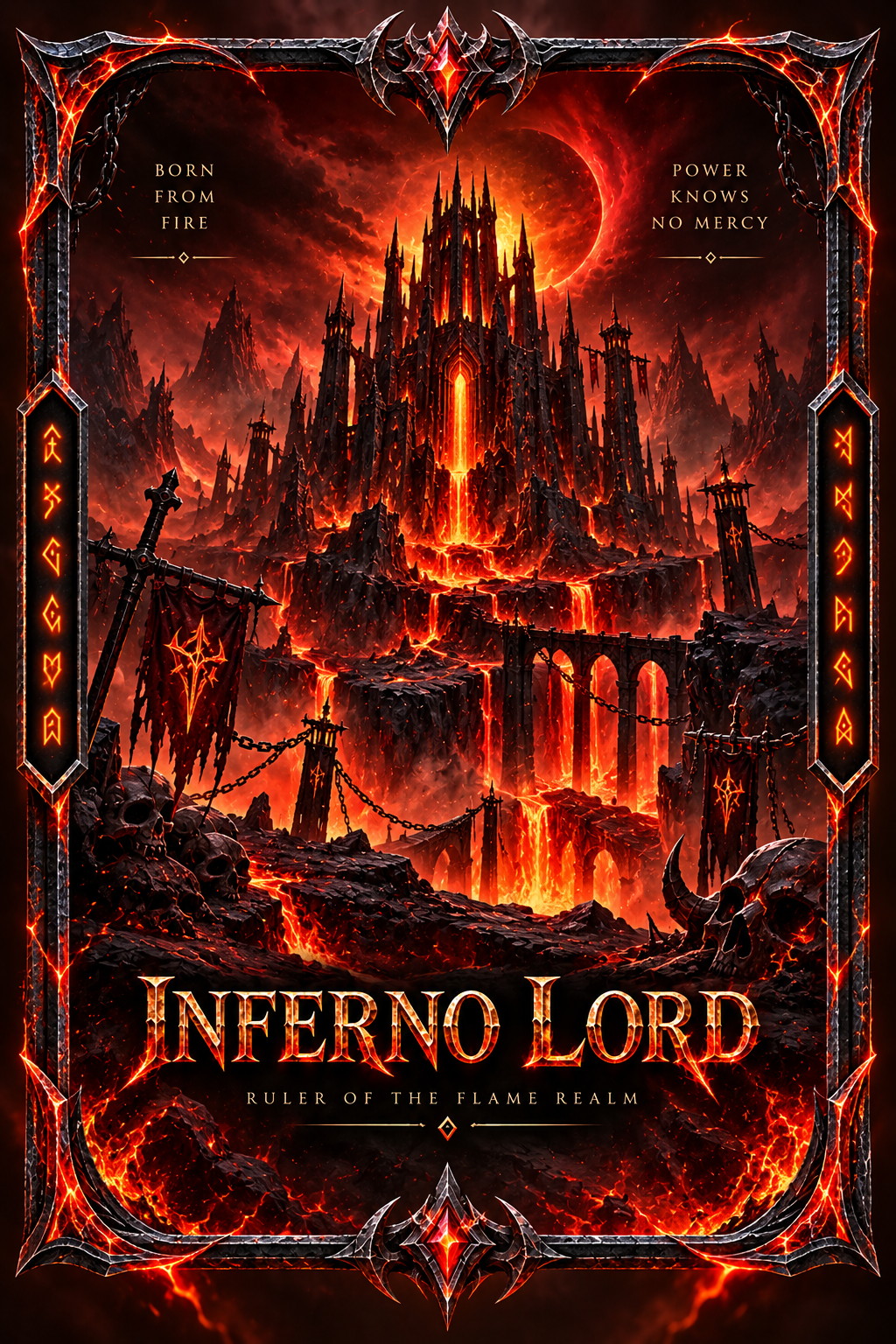
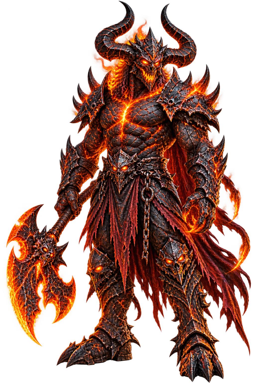
<div class="cr-monster-stage">

  <div class="cr-monster-grid">


    <article class="cr-monster-card cr-ice">

      <div class="cr-card-scene">

        <div class="cr-card-floor">

          <img
            class="cr-card-cover"
            src="https://getcoderipple.com/wp-content/uploads/2026/09/Ice-Lich-Eternal-Winter.png"
            alt="Ice Lich fantasy card with frozen castle and glowing blue runes"
          >

        </div>

        <img
          class="cr-monster-character"
          src="https://getcoderipple.com/wp-content/uploads/2026/09/Frostbound-Lich-King-with-Ice-Staff.png"
          alt="Frostbound Lich King fantasy character with glowing ice staff"
        >

        <div class="cr-monster-glow"></div>

      </div>

    </article>


    <article class="cr-monster-card cr-fire">

      <div class="cr-card-scene">

        <div class="cr-card-floor">

          <img
            class="cr-card-cover"
            src="https://getcoderipple.com/wp-content/uploads/2026/09/Inferno-Lord-Citadel-of-Fire.png"
            alt="Inferno Lord fantasy card with fiery citadel and lava landscape"
          >

        </div>

        <img
          class="cr-monster-character"
          src="https://getcoderipple.com/wp-content/uploads/2026/09/Molten-Lava-Demon-Warlord.png"
          alt="Molten lava demon warlord with flaming battle axe"
        >

        <div class="cr-monster-glow"></div>

      </div>

    </article>


    <article class="cr-monster-card cr-void">

      <div class="cr-card-scene">

        <div class="cr-card-floor">

          <img
            class="cr-card-cover"
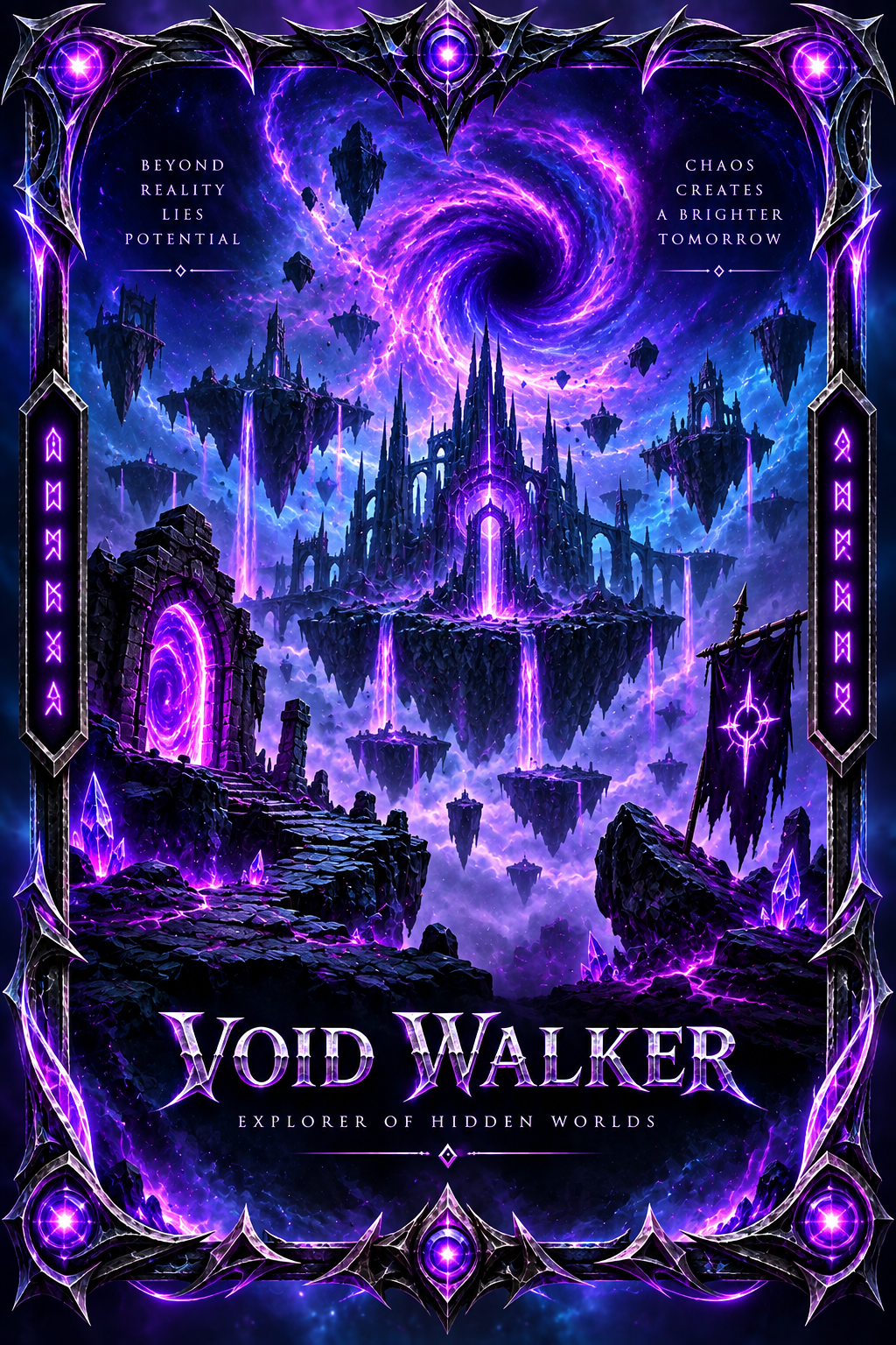
            src="https://getcoderipple.com/wp-content/uploads/2026/09/Void-Walker-Beyond-Reality.png"
            alt="Void Walker fantasy card with purple vortex and floating dark realm"
          >

        </div>

        <img
          class="cr-monster-character"
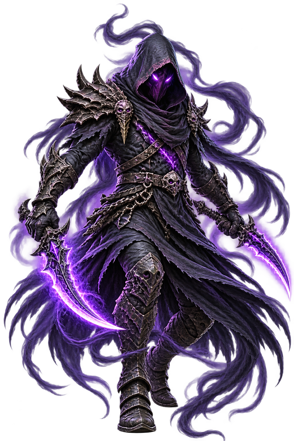
          src="https://getcoderipple.com/wp-content/uploads/2026/09/Hooded-Necromancer-with-Purple-Blades.png"
          alt="Hooded void necromancer with glowing purple blades"
        >

        <div class="cr-monster-glow"></div>

      </div>

    </article>


    <article class="cr-monster-card cr-forest">

      <div class="cr-card-scene">

        <div class="cr-card-floor">

          <img
            class="cr-card-cover"
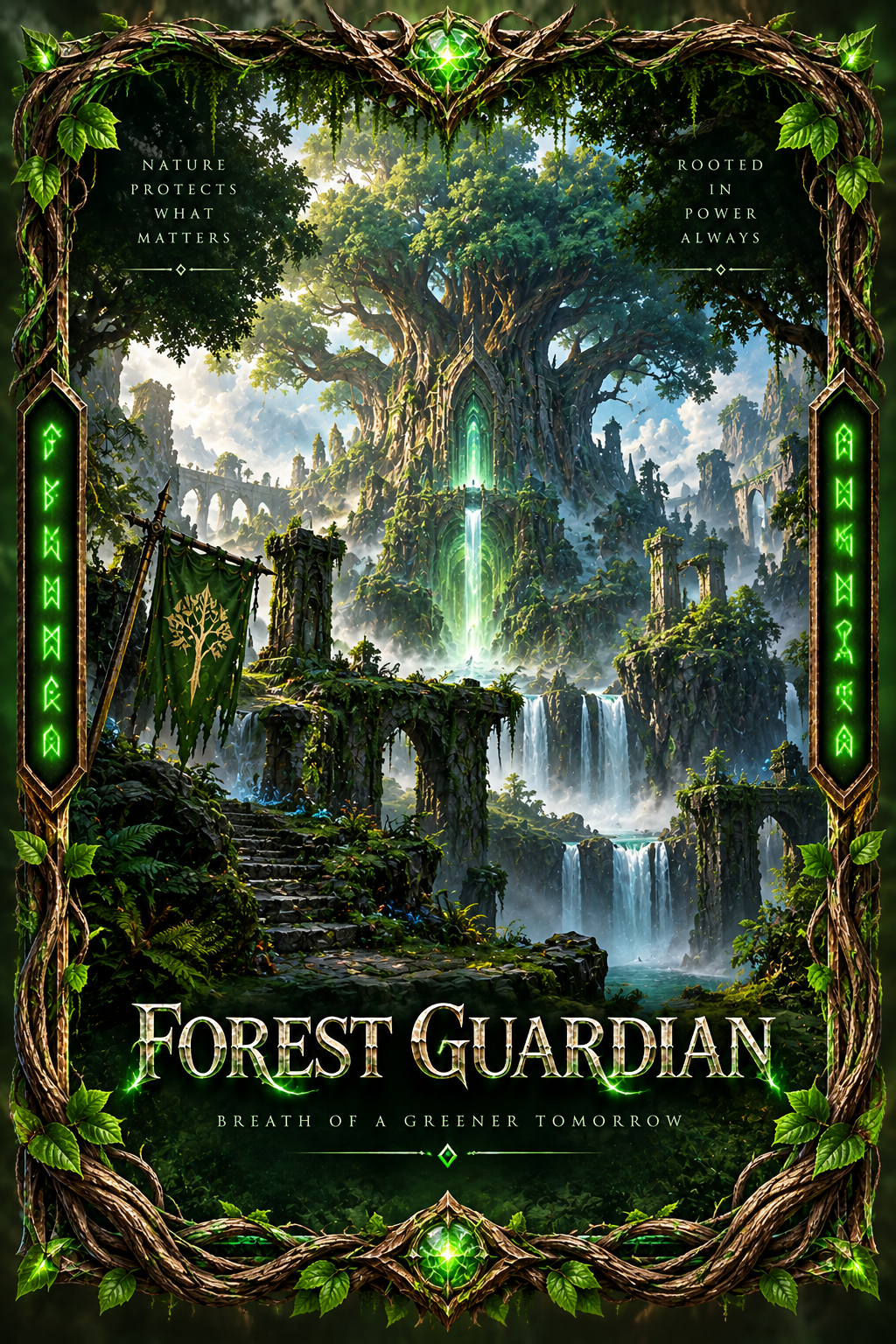
            src="https://getcoderipple.com/wp-content/uploads/2026/09/Forest-Guardian-Sanctuary.png"
            alt="Forest Guardian fantasy card with ancient tree sanctuary and glowing green runes"
          >

        </div>

        <img
          class="cr-monster-character"
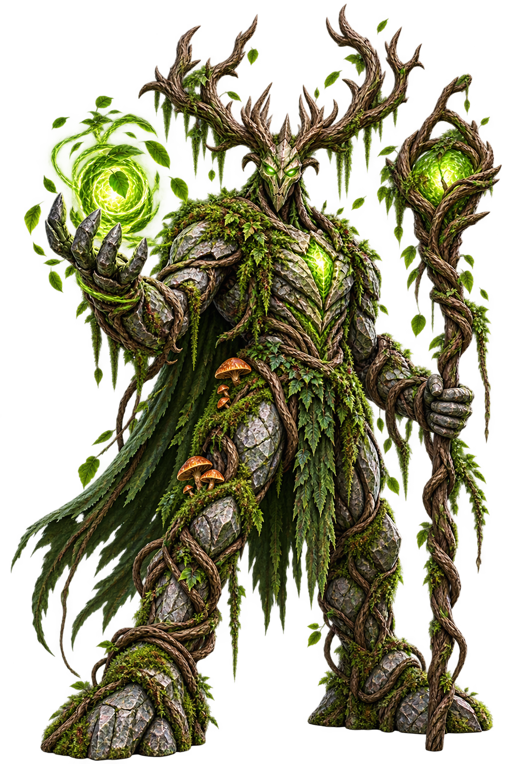
          src="https://getcoderipple.com/wp-content/uploads/2026/09/Emerald-Stonewood-Guardian.png"
          alt="Emerald stonewood forest guardian with glowing nature staff"
        >

        <div class="cr-monster-glow"></div>

      </div>

    </article>


  </div>

</div>*{
box-sizing:border-box;
}
.cr-monster-stage{
width:100%;
min-height:760px;
display:flex;
align-items:center;
justify-content:center;
padding:70px 30px;
background:
radial-gradient(
circle at 50% 45%,
rgba(34,211,238,.07),
transparent 38%
),
#050914;
font-family:Inter,Arial,sans-serif;
overflow:visible;
}
.cr-monster-grid{
width:min(1100px,100%);
display:grid;
grid-template-columns:repeat(4,1fr);
gap:26px;
}
.cr-monster-card{
position:relative;
height:520px;
perspective:1100px;
perspective-origin:50% 42%;
overflow:visible;
}
.cr-card-scene{
position:relative;
width:100%;
height:100%;
transform-style:preserve-3d;
overflow:visible;
}
.cr-card-floor{
position:absolute;
z-index:3;
left:50%;
bottom:55px;
width:220px;
height:330px;
transform:
translateX(-50%)
rotateX(0deg)
translateZ(0);
transform-origin:50% 100%;
transform-style:preserve-3d;
transition:
transform .8s cubic-bezier(.2,.75,.2,1),
filter .8s ease;
will-change:transform;
}
.cr-card-cover{
width:100%;
height:100%;
display:block;
object-fit:cover;
border-radius:10px;
user-select:none;
pointer-events:none;
box-shadow:
0 25px 45px rgba(0,0,0,.55),
0 0 0 1px rgba(255,255,255,.14);
transition:
box-shadow .8s ease,
filter .8s ease;
}
.cr-monster-character{
position:absolute;
z-index:7;
left:50%;
bottom:82px;
width:245px;
max-width:none;
height:auto;
display:block;
opacity:0;
transform:
translateX(-50%)
translateY(80px)
scale(.56);
transform-origin:50% 100%;
filter:
drop-shadow(0 25px 18px rgba(0,0,0,.65));
pointer-events:none;
user-select:none;
transition:
opacity .28s ease,
transform .85s cubic-bezier(.16,.8,.2,1),
filter .75s ease;
will-change:transform,opacity;
}
.cr-monster-glow{
position:absolute;
z-index:2;
left:50%;
bottom:42px;
width:210px;
height:55px;
border-radius:50%;
opacity:0;
transform:
translateX(-50%)
scale(.45);
filter:blur(16px);
pointer-events:none;
transition:
opacity .65s ease,
transform .8s ease;
}
.cr-monster-card:hover .cr-card-floor{
transform:
translateX(-50%)
translateY(62px)
rotateX(72deg)
scale(.96);
}
.cr-monster-card:hover .cr-card-cover{
filter:brightness(.72) saturate(1.25);
box-shadow:
0 40px 55px rgba(0,0,0,.72),
0 0 0 1px rgba(255,255,255,.16);
}
.cr-monster-card:hover .cr-monster-character{
opacity:1;
transform:
translateX(-50%)
translateY(-40px)
scale(1);
filter:
drop-shadow(0 32px 22px rgba(0,0,0,.75));
}
.cr-monster-card:hover .cr-monster-glow{
opacity:.9;
transform:
translateX(-50%)
scale(1);
}
.cr-ice .cr-monster-glow{
background:
radial-gradient(
ellipse,
rgba(34,211,238,.85) 0%,
rgba(37,99,235,.40) 38%,
transparent 72%
);
}
.cr-ice:hover .cr-monster-character{
filter:
drop-shadow(0 28px 18px rgba(0,0,0,.75))
drop-shadow(0 0 16px rgba(34,211,238,.65));
}
.cr-fire .cr-monster-glow{
background:
radial-gradient(
ellipse,
rgba(255,92,20,.95) 0%,
rgba(220,38,38,.45) 40%,
transparent 72%
);
}
.cr-fire:hover .cr-monster-character{
filter:
drop-shadow(0 28px 18px rgba(0,0,0,.75))
drop-shadow(0 0 17px rgba(255,80,20,.65));
}
.cr-void .cr-monster-glow{
background:
radial-gradient(
ellipse,
rgba(168,85,247,.95) 0%,
rgba(109,40,217,.45) 40%,
transparent 72%
);
}
.cr-void:hover .cr-monster-character{
filter:
drop-shadow(0 28px 18px rgba(0,0,0,.75))
drop-shadow(0 0 18px rgba(168,85,247,.72));
}
.cr-forest .cr-monster-glow{
background:
radial-gradient(
ellipse,
rgba(74,222,128,.90) 0%,
rgba(22,163,74,.40) 40%,
transparent 72%
);
}
.cr-forest:hover .cr-monster-character{
filter:
drop-shadow(0 28px 18px rgba(0,0,0,.75))
drop-shadow(0 0 17px rgba(74,222,128,.60));
}
.cr-monster-card::after{
content:"";
position:absolute;
z-index:1;
left:50%;
bottom:38px;
width:190px;
height:34px;
border-radius:50%;
background:rgba(0,0,0,.68);
filter:blur(15px);
opacity:.25;
transform:
translateX(-50%)
scale(.7);
transition:
opacity .7s ease,
transform .8s ease;
}
.cr-monster-card:hover::after{
opacity:.8;
transform:
translateX(-50%)
scale(1.12);
}
@media(max-width:1000px){
.cr-monster-grid{
grid-template-columns:repeat(2,1fr);
gap:30px;
}
.cr-monster-stage{
padding-top:50px;
padding-bottom:50px;
}
}
@media(max-width:600px){
.cr-monster-stage{
padding:40px 18px;
}
.cr-monster-grid{
grid-template-columns:1fr;
}
.cr-monster-card{
height:500px;
}
.cr-card-floor{
width:215px;
height:322px;
}
.cr-monster-character{
width:235px;
}
}How These 3D Hover Monster Cards Work
The 3D Hover Monster Cards create a fantasy card reveal using only HTML and CSS. The component contains four themed cards: ice, fire, void, and forest. Each card combines a background card image, a separate transparent monster character image, and a colored glow layer. There is no JavaScript in this component; the complete interaction is controlled by CSS :hover states and transitions.
The cards sit inside .cr-monster-grid, which uses CSS Grid with four equal columns and a 26px gap. Each .cr-monster-card is 520px tall and sets perspective: 1100px. This perspective establishes the viewing depth needed for the card artwork to appear as though it is rotating away from the viewer rather than simply being flattened.
Inside each card, .cr-card-scene uses transform-style: preserve-3d. The card cover itself is placed inside .cr-card-floor, which starts upright at 220px wide and 330px high. When the user hovers over the card, this layer moves down by 62px and rotates on the X axis by 72 degrees. A slight scale(.96) makes the tilted card feel more distant. The transformation takes 0.8 seconds and uses a custom cubic-bezier timing function.
The separate .cr-monster-character image creates the pop-out effect. Initially, it has opacity: 0, is translated 80px downward, and is reduced to scale(.56). On hover, its opacity becomes fully visible, it moves upward to translateY(-40px), and scales to its full size. The 0.85-second transform transition makes the character emerge while the card underneath rotates toward the floor.
For more detail on how these transformations work, see the MDN CSS transform documentation.
Lighting reinforces the depth effect. .cr-monster-glow starts hidden and scaled to 45%. On hover it reaches opacity: .9 and full scale. Each theme supplies its own radial gradient: cyan and blue for ice, orange and red for fire, purple for void, and green for forest. The monster images also receive matching colored drop-shadow() effects while hovered.
A second shadow is generated with the .cr-monster-card::after pseudo-element. It sits near the bottom of the scene as a blurred black ellipse. Its opacity increases from .25 to .8 and its scale grows to 1.12 during hover, helping visually anchor the raised character and tilted card.
The layout is responsive as well. Below 1000px, the grid changes from four columns to two. Below 600px, it becomes a single-column layout, while the card floor and character dimensions are reduced slightly.
Customizing These 3D Hover Monster Cards
Most visual changes can be made directly through the existing CSS classes without changing how the effect is structured.
- Change the 220px by 330px
.cr-card-floordimensions to resize the main card artwork. - Adjust
perspective: 1100pxto change how strongly the 3D rotation is perceived. - Modify
rotateX(72deg)andtranslateY(62px)to control how far the card tilts and drops on hover. - Change the character’s 245px width or its
translateY(-40px)hover position to alter the pop-out size and height. - Edit the
.8sand.85stransition durations to make the card and character animation faster or slower. - Customize the cyan, orange, purple, and green radial gradients in the theme classes to create different glow colors.
- Adjust the matching
drop-shadow()values to change the colored light around each monster. - Change the 1000px and 600px media-query breakpoints if the four-, two-, and one-column layouts need to switch at different screen widths.
Where to Use These 3D Hover Monster Cards
This interaction works best when artwork is an important part of the interface and a hover reveal can provide additional visual depth.
- Fantasy game character galleries or monster collections
- Trading-card and collectible showcases
- RPG class, enemy, or boss selection screens
- Game landing pages with interactive artwork
- Portfolio projects featuring fantasy illustration or concept art
- Promotional sections for games, books, or fictional worlds
- Character selection interfaces on desktop-focused experiences
Because the effect separates the foreground character from the card artwork, both images need to work together visually for the illusion to be convincing. For another layered card treatment, the 3D Fantasy Book Cover Pop-Out Cards component is a useful related example.
Frequently Asked Questions
Do these 3D Hover Monster Cards require JavaScript?
No. The published component contains no JavaScript. Its reveal, rotation, scaling, shadows, and glow effects are all handled with CSS hover selectors and transitions.
How is the 3D card tilt created?
Each card establishes a 1100px perspective, while the card floor is transformed with rotateX(72deg) on hover. It also moves down 62px and scales slightly to reinforce the impression that the card is tilting backward into the scene.
Why is the monster character stored as a separate image?
The separate .cr-monster-character layer allows the character to move and scale independently from the card cover. It begins hidden at scale(.56) and then rises to translateY(-40px) at full scale when the card is hovered.
Are the monster cards responsive?
Yes. The layout starts with four columns, switches to two columns below 1000px, and becomes one column below 600px. The mobile media query also reduces the floor and character image sizes.
The 3D Hover Monster Cards achieve their pop-out effect by combining perspective, layered images, X-axis rotation, scaling, shadows, and theme-specific glows. Since the interaction is CSS-only, the component remains straightforward to understand and customize.