
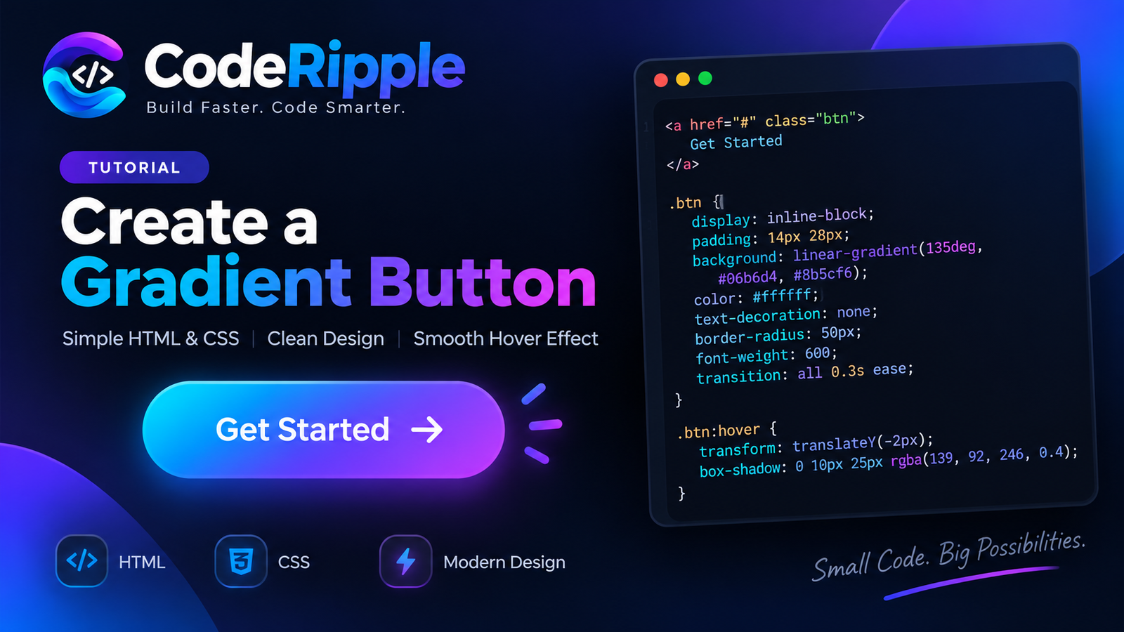
CSS Button Effects can turn simple buttons into more engaging and responsive interface elements. With a few lines of HTML, CSS, and JavaScript, you can add smooth hover animations, glowing borders, ripple feedback, gradients, shine effects, and realistic press interactions. In this guide, we’ll explore 10+ CSS button effects that you can customize and use in landing pages, portfolios, dashboards, and other modern web projects.
What We’re Building
In this collection, we’re exploring more than 10 button effects, from gradient and neon styles to ripple clicks, animated borders, glassmorphism, shine effects, and realistic press interactions. Each example focuses on a different technique, so you can see how small changes in CSS and JavaScript can completely change the way a button looks and responds to the user.
Live Preview — Hover over the button to see the effect
Add the HTML
Start with a standard button element and keep any extra visual elements, such as arrows or icons, in separate spans when needed. This keeps the HTML structure clean while allowing individual parts of the button to move or animate independently with CSS.
<button class="gradient-btn">
  Get Started
  <span class="arrow">→</span>
</button>
Style the Button with CSS
CSS handles most of the visual work behind these button effects, including gradients, borders, shadows, rounded shapes, hover movement, and smooth transitions. Some effects also use pseudo-elements such as ::before or ::after to create animated shine, overlays, and decorative layers without adding extra HTML.
.gradient-btn {
  position: relative;
  overflow: hidden;
  display: inline-flex;
  align-items: center;
  gap: 10px;
  padding: 14px 30px;
  border: none;
  border-radius: 999px;
  background: linear-gradient(90deg, #22d3ee, #8b5cf6);
  color: #fff;
  font-size: 16px;
  font-weight: 700;
  cursor: pointer;
  transition: transform 0.3s ease, box-shadow 0.3s ease,
              background 0.3s ease;
}

.gradient-btn::before {
  content: "";
  position: absolute;
  top: 0;
  left: -100%;
  width: 60%;
  height: 100%;
  background: rgba(255, 255, 255, 0.25);
  transform: skewX(-20deg);
  transition: left 0.5s ease;
}

.gradient-btn:hover {
  transform: translateY(-3px);
  background: linear-gradient(90deg, #8b5cf6, #22d3ee);
  box-shadow: 0 8px 24px rgba(139, 92, 246, 0.35);
}

.gradient-btn:hover::before {
  left: 140%;
}

.gradient-btn .arrow {
  transition: transform 0.3s ease;
}

.gradient-btn:hover .arrow {
  transform: translateX(5px);
}
How CSS Button Effects Work
These button effects combine different CSS techniques to create clear visual feedback during interaction. Depending on the design, a button may lift, scale, glow, change its gradient, animate a border, reveal a shine layer, or move an icon when the user hovers or clicks. CSS transitions keep these changes smooth, while JavaScript is only used for effects that need click-based interaction, such as the ripple animation.
One useful approach is to keep each interaction focused instead of combining too many animations at once. A small lift, controlled glow, or short transition is often enough to make a button feel responsive. The examples in this collection use different combinations of these techniques, making it easier to compare them and choose an effect that suits the purpose and visual style of your interface. You can learn more about CSS transitions in the MDN Web Docs guide to CSS transitions.
Try It Yourself
Copy any button’s HTML, CSS, and JavaScript into the CodeRipple Playground to test it yourself. Experiment with gradient colors, glow intensity, animation speed, border styles, hover movement, or shadows and see the result instantly. This is also an easy way to understand how small CSS changes can give the same button a completely different look and feel.
Final Thoughts
Modern CSS Button Effects don’t need heavy libraries or complicated code. Gradients, shadows, pseudo-elements, transforms, and transitions can handle most visual interactions, while a small amount of JavaScript can add click-based effects when needed. These examples give you a practical starting point, but the colors, movement, timing, and styling can easily be adjusted to create button designs that fit your own project.
The best effect depends on where the button is used. A subtle animation may work better in a professional interface, while neon glows, animated borders, or colorful gradients can add more personality to creative projects. The goal is to make the interaction noticeable without distracting users from the action itself.
Explore More Button Effects
Liquid Gradient Button
A smooth neon-style gradient button with a glowing hover effect. Copy the code and use it in your own project.
Open in Playground →Neon Glow Button
A clean neon-style button with a glowing border and smooth hover effect. Copy the code and use it in your own project.
Open in Playground →Glassmorphism Button
A modern glass-style button with a translucent background, soft border and smooth hover effect. Copy the code and use it in your own project.
Open in Playground →3D Press Button
A tactile 3D-style button with a realistic pressed effect. Copy the code and use it in your own project.
Open in Playground →Animated Border Button
A modern button with a colorful animated border and smooth hover effect. Copy the code and use it in your own project.
Open in Playground →Shine Shimmer Button
A stylish button with a smooth light sweep animation that creates a clean shimmer effect on hover. Copy the code and use it in your own project.
Open in Playground →Ripple Click Button
An interactive button that creates a smooth ripple effect exactly where you click. Copy the HTML, CSS and JavaScript for your own project.
Open in Playground →Sliding Background Button
A modern button with a smooth background layer that slides across on hover. Copy the code and use it in your own project.
Open in Playground →Icon Arrow Button
A clean call-to-action button with an animated arrow that moves on hover. Copy the code and use it in your own project.
Open in Playground →Magnetic Hover Button
An interactive button that subtly follows the cursor while hovering and smoothly returns to its original position. Copy the HTML, CSS and JavaScript for your own project.
Open in Playground →Loading Button
An interactive loading button that shows a spinner while processing and displays a success state when complete. Copy the HTML, CSS and JavaScript for your own project.
Open in Playground →Social CTA Gradient Button
A bold gradient call-to-action button with a smooth shine effect and animated arrow on hover. Copy the HTML and CSS for your own project.
Open in Playground →Liquid Glass Focus Mode Buttons
A sleek set of liquid glass focus buttons with colorful hover fills, soft glow effects and smooth interactive selection.
Open in Playground →