
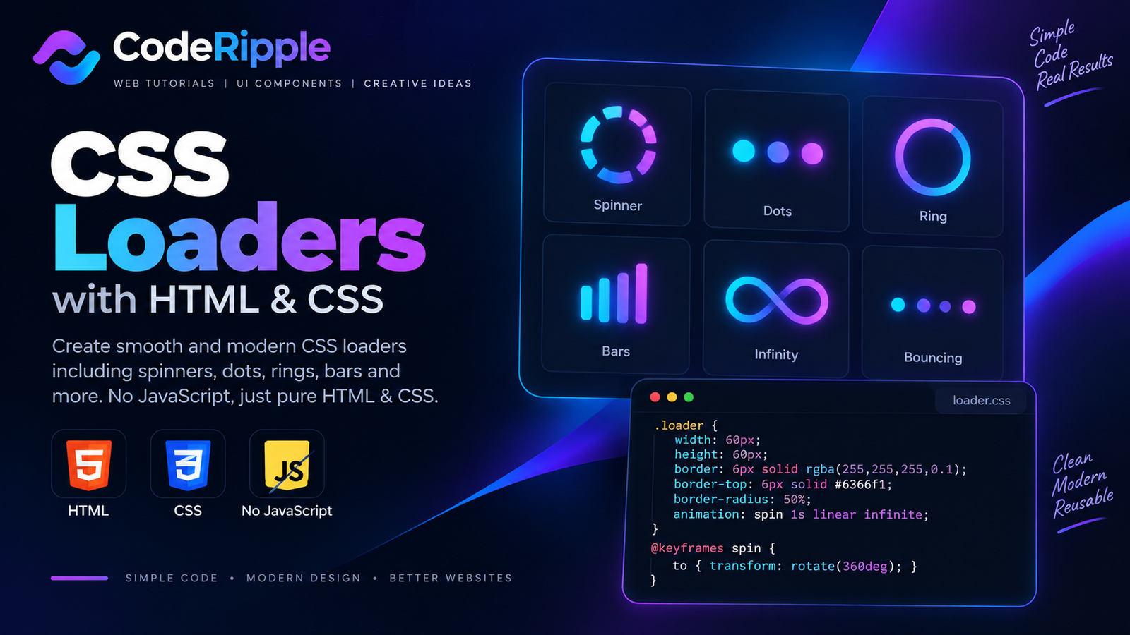
CSS Loaders provide clear visual feedback while a website, page, or component is processing or loading content. With lightweight CSS animations, you can create spinners, dots, rings, bars, and other loading indicators without relying on images or external libraries. In this tutorial, we’ll build a simple animated spinner and explore more CSS Loaders you can use for buttons, forms, page transitions, dashboards, and other interactive interfaces.
What We’re Building
In this tutorial, we’ll create a clean animated spinner that works entirely with HTML and CSS. The loader uses lightweight animation to provide clear visual feedback while content is being processed. The same techniques can also be adapted to create different CSS Loaders for buttons, forms, page transitions, dashboards, and other loading states.
Live Preview
Here’s the finished loader in action. Watch how the spinner rotates continuously to provide a clear loading indicator without distracting from the surrounding interface. The animation is created entirely with CSS, so no images or external libraries are required.
Live Preview — Watch the loader animate
Add the HTML
Start with a simple HTML element that acts as the visual container for the loader. Keeping the markup minimal makes the component lightweight and easy to reuse, while CSS handles the shape, colors, and animation. The same basic structure can also be adapted for different CSS Loaders without adding unnecessary HTML.
<div class="spinner-loader" aria-label="Loading"></div>Style the Loader with CSS
CSS creates the spinner by giving the loader a circular shape with borders and highlighting one section with a contrasting color. A @keyframes animation continuously rotates the element, producing a smooth loading effect. You can reuse this approach across different CSS Loaders by adjusting the size, border width, colors, and animation speed.
.spinner-loader{
  width:64px;
  height:64px;
  border:6px solid rgba(34,211,238,.18);
  border-top-color:#22d3ee;
  border-right-color:#8b5cf6;
  border-radius:50%;

  animation:spinnerRotate 1s linear infinite;
}

@keyframes spinnerRotate{
  to{
    transform:rotate(360deg);
  }
}
How the Loader Works
The loader works by combining a circular border with CSS rotation. Most of the border uses a subtle color, while one section uses a brighter accent color to create a visible point of movement. The @keyframes rule rotates the element continuously through 360 degrees, producing the familiar spinner effect. Because the animation runs entirely in CSS, the component remains lightweight, responsive, and easy to customize.
Why Use CSS Loaders?
CSS Loaders give users clear visual feedback when content or an action takes time to complete. Instead of leaving the interface looking unresponsive, a loader communicates that the website is still working while keeping the experience smooth and understandable.
- Clear feedback – Show users that an action is still processing.
- Lightweight animation – Create loaders without images or heavy libraries.
- Easy customization – Adjust size, colors, speed, and animation style.
- Reusable design – Use the same loader across different parts of a website.
- Responsive behavior – Keep loading indicators consistent across screen sizes.
Where You Can Use CSS Loaders
CSS Loaders can be used anywhere an interface needs to communicate that content, data, or an action is still being processed. They work well for both full-page loading states and smaller individual components.
- Page loading – Show progress while website content is being prepared.
- Buttons – Indicate that a form or action is being submitted.
- Forms – Provide feedback during validation or data processing.
- Dashboards – Display loading states while fetching data.
- Content sections – Use loaders while dynamic content is being retrieved.
- Modal windows – Show processing states before content appears.
Customizing the Loader
You can customize these CSS Loaders by changing the size, border thickness, colors, animation speed, and rotation direction. You can also experiment with multiple rings, dots, gradients, or different animation patterns to create a loader that matches your website’s visual style while keeping the component lightweight.
Try It Yourself
Want to experiment with the loader yourself? Open the CodeRipple Playground, paste the HTML and CSS, and try changing the size, colors, border thickness, or animation speed. You can preview your changes instantly and customize the loader to match your own website or project.
Final Thoughts
CSS Loaders are a simple and effective way to provide visual feedback while content or actions are being processed. With only a small amount of HTML and CSS, you can create lightweight loading animations that are responsive, reusable, and easy to customize. Experiment with different shapes, colors, sizes, and animation speeds to create a loader that fits your own project.
Explore More CSS Loaders
Pulse Loader
A clean animated loader with three pulsing dots. It works with pure HTML and CSS, so you can use it without JavaScript or extra libraries.
Open in Playground →Spinning Ring Loader
A smooth circular loader with a rotating cyan ring. It uses pure HTML and CSS, making it lightweight and easy to reuse in any interface.
Open in Playground →Bouncing Dots Loader
A playful three-dot loader with a smooth bouncing animation. It uses only HTML and CSS, so it stays lightweight and easy to reuse.
Open in Playground →Ripple Loader
A smooth ripple loader made with expanding circular rings. It uses pure HTML and CSS with no JavaScript required.
Open in Playground →Bars Loader
A simple animated loader made with vertical bars that rise and fall in sequence. It uses only HTML and CSS with no JavaScript required.
Open in Playground →Orbit Loader
A clean circular loader with a small dot orbiting around the center. It uses only HTML and CSS, so it stays lightweight and easy to reuse.
Open in Playground →Dual Ring Loader
A modern loader with two rotating rings moving in opposite directions. It uses pure HTML and CSS, with no JavaScript required.
Open in Playground →Square Flip Loader
A compact loader with a square that flips smoothly between two sides. It uses pure HTML and CSS with no JavaScript required.
Open in Playground →Gradient Spinner Loader
A colorful circular spinner with a smooth cyan-to-purple gradient. It uses pure HTML and CSS with no JavaScript required.
Open in Playground →Chasing Dots Loader
A circular loader with glowing dots that chase each other around the center. It uses pure HTML and CSS with no JavaScript required.
Open in Playground →Hourglass Loader
A clean rotating hourglass-style loader built with pure HTML and CSS. It works well for loading states, waiting screens, and compact UI elements.
Open in Playground →Progress Bar Loader
A smooth animated progress bar with a glowing gradient effect. It uses pure HTML and CSS and works well for loading states and waiting screens.
Open in Playground →Neon Energy Progress Loader
A futuristic animated progress loader with neon energy effects, live percentage tracking, glowing motion and a completed state.
Open in Playground →