
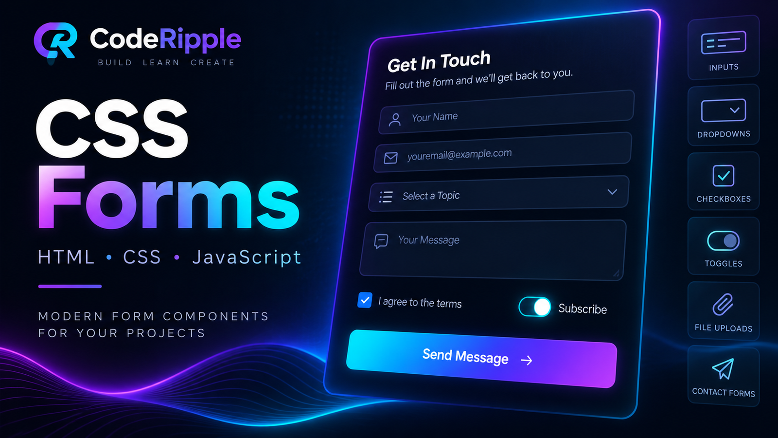
CSS Forms are an essential part of modern websites, helping users submit information, sign in, search, upload files, change settings, and interact with different features. With HTML, CSS, and JavaScript, basic form controls can be transformed into clean, responsive, and user-friendly interface components. In this tutorial, we’ll build a modern contact form and explore more CSS Forms including inputs, checkboxes, radio buttons, toggle switches, dropdowns, file uploads, and other reusable form elements.
What We’re Building
In this tutorial, we’ll create one of the most useful CSS Forms, a modern dark contact form with styled input fields, a message area, and an interactive submit button. The layout is responsive, easy to customize, and designed to provide a clean user experience across desktop and mobile screens. The same styling techniques can also be reused for login forms, registration forms, settings panels, and other form-based interfaces.
Live Preview
Here’s the finished contact form in action. Try entering text into the fields and interacting with the submit button to see how the form responds before exploring the HTML, CSS, and JavaScript behind it.
Add the HTML
Start by creating the basic structure of the contact form with HTML. Each field includes a clear label and the appropriate input type, while the message area uses a textarea for longer content. Keeping the markup simple and organized makes the form easier to style, validate, and reuse in other CSS Forms.
<form class="contact-form">

  <div class="contact-form-row">

    <div class="contact-field">
      <label for="name">Name</label>
      <input
        type="text"
        id="name"
        placeholder="Your name"
        required
      >
    </div>

    <div class="contact-field">
      <label for="email">Email</label>
      <input
        type="email"
        id="email"
        placeholder="you@example.com"
        required
      >
    </div>

  </div>

  <div class="contact-field">
    <label for="message">Message</label>

    <textarea
      id="message"
      rows="5"
      placeholder="Write your message..."
      required
    ></textarea>
  </div>

  <button type="submit" class="contact-submit">
    Send Message →
  </button>

</form>
Style the Form with CSS
CSS turns the basic form structure into a polished interface by controlling the layout, spacing, colors, typography, borders, and focus states. The input fields and textarea use consistent styling, while hover and focus effects provide clear visual feedback during interaction. Responsive rules also help these CSS Forms remain comfortable to use across different screen sizes.
.contact-form{
  width:100%;
  max-width:650px;
}

.contact-form-row{
  display:grid;
  grid-template-columns:1fr 1fr;
  gap:18px;
}

.contact-field{
  margin-bottom:18px;
}

.contact-field label{
  display:block;
  margin-bottom:8px;
  color:#aab4c8;
  font-size:13px;
  font-weight:600;
}

.contact-field input,
.contact-field textarea{
  width:100%;
  box-sizing:border-box;
  padding:14px 15px;
  border:1px solid #263750;
  border-radius:9px;
  background:#0b1423;
  color:#ffffff;
  font:inherit;
  outline:none;
  transition:.25s ease;
}

.contact-field input::placeholder,
.contact-field textarea::placeholder{
  color:#65748b;
}

.contact-field input:focus,
.contact-field textarea:focus{
  border-color:#22d3ee;
  box-shadow:0 0 0 3px rgba(34,211,238,.10);
}

.contact-submit{
  min-height:46px;
  padding:0 20px;
  border:0;
  border-radius:9px;
  background:linear-gradient(135deg,#22d3ee,#7c3aed);
  color:#ffffff;
  font-weight:700;
  cursor:pointer;
}

@media(max-width:600px){
  .contact-form-row{
    grid-template-columns:1fr;
    gap:0;
  }
}
Add JavaScript Interaction
JavaScript adds interactive behavior to the form by listening for the submit event and responding to the user’s action. In this example, it prevents the default page refresh and displays a confirmation message after submission. The same approach can later be extended with form validation, error messages, API requests, or other interactive features for more advanced CSS Forms.
const form = document.querySelector('.contact-form');

form.addEventListener('submit', function(event) {

  event.preventDefault();

  alert('Message submitted successfully!');

  form.reset();

});
How the Form Works
The form combines three layers that work together. HTML provides the structure and defines each field, CSS controls the layout, colors, spacing, focus states, and responsive appearance, while JavaScript handles the submit interaction. In a real project, these CSS Forms can also be connected to a backend, API, or form service to validate, process, and securely store submitted data.
Why Use Custom CSS Forms?
Custom CSS Forms give you more control over the appearance and behavior of form elements so they match the rest of your website. Instead of relying only on default browser styles, you can create consistent inputs, buttons, focus states, spacing, and responsive layouts while still keeping the form clear and easy to use.
- Consistent design – Match form elements with your website’s visual style.
- Better usability – Clear focus states and spacing make forms easier to complete.
- Responsive layout – Keep fields comfortable to use across desktop and mobile screens.
- Reusable styling – Apply the same design system to contact, login, signup, and settings forms.
- More interaction control – Add validation, messages, toggles, and other custom behaviors.
Where You Can Use These Forms
CSS Forms can be used anywhere a website needs to collect information or provide interactive controls. Their reusable structure makes them suitable for simple contact pages as well as more advanced account, search, checkout, and dashboard interfaces.
- Contact pages – Collect messages and customer inquiries.
- Login and signup screens – Create clean authentication interfaces.
- Search forms – Provide simple and accessible search controls.
- Newsletter forms – Collect email subscriptions and leads.
- Account settings – Manage profile details and preferences.
- Feedback forms – Gather ratings, comments, and user responses.
Customizing the Form
You can customize these CSS Forms by changing the colors, border radius, spacing, field sizes, typography, and button styles. You can also add new fields such as phone numbers, dropdown menus, checkboxes, radio buttons, or file uploads. For more advanced projects, JavaScript can be used to add validation, dynamic messages, conditional fields, and other interactive behavior.
Try It Yourself
Want to experiment with the form yourself? Open the CodeRipple Playground, paste the HTML, CSS, and JavaScript, and try changing the colors, spacing, field styles, button design, or validation behavior. You can preview your changes instantly and customize the form to match your own website or project.
Final Thoughts
CSS Forms are an essential part of modern web interfaces, and thoughtful styling can make them clearer, more consistent, and easier to use. By combining structured HTML, responsive CSS, and lightweight JavaScript, you can build reusable forms for many different types of websites. Experiment with different fields, layouts, colors, and interactions to create forms that fit your own project.
Explore More CSS Form Components
Floating Label Input
A clean floating label input that moves the label above the field when the input is focused or contains text.
Open in Playground →Glow Focus Input
A modern dark input field with a smooth cyan glow that appears when the user clicks or focuses on the input.
Open in Playground →Password Show Hide Input
A modern password field with a show and hide button so users can quickly check the password they have entered.
Open in Playground →Search Input with Icon
A clean search field with a built-in search icon and smooth focus effect, designed for modern websites and application interfaces.
Open in Playground →Animated Border Input
A modern input field with a smooth animated gradient border that becomes active when the user focuses on the field.
Open in Playground →Textarea with Character Counter
A clean textarea with a live character counter that updates as the user types, useful for messages, comments, and limited-length form fields.
Open in Playground →Custom Select Dropdown
A fully custom dropdown with a clean dark design, smooth opening animation, and selectable options without relying on the browser's default select styling.
Open in Playground →Custom Checkbox
A clean custom checkbox with a modern dark style, smooth animation, and a clear checked state for forms and settings panels.
Open in Playground →Custom Radio Buttons
Modern custom radio buttons with a clean dark design, smooth selection animation, and a glowing active state.
Open in Playground →Toggle Switch
A modern toggle switch with a smooth sliding animation, clear active state, and dark UI styling for settings and forms.
Open in Playground →File Upload Input
A modern file upload input with a clean dark design, custom upload button, and selected file name display.
Open in Playground →Contact Form
A clean modern contact form with name, email, and message fields, designed for dark websites and responsive layouts.
Open in Playground →Circular Gradient Login Form
A circular dark login form with gradient accents, password visibility control, social login buttons and responsive styling.
Open in Playground →Interactive Schedule Calendar App
A responsive schedule calendar with month navigation, daily tasks, notes, search and an interactive add schedule form.
Open in Playground →Interactive Lamp Login Reveal Form
A futuristic lamp-controlled login form with glowing light effects, glassmorphism styling and smooth JavaScript reveal interaction.
Open in Playground →Animated S-Wave Login & Sign Up Form
A modern animated authentication form with a glowing SVG S-wave panel, smooth 180-degree transition, login and sign-up states.
Open in Playground →