
3D Smartwatch Fitness Dashboard Reveal Card
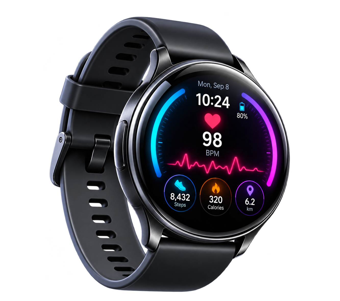
An interactive smartwatch fitness card with a glowing dial, animated health stats, product pop-out and smooth 3D reveal.
STAY ACTIVE LIVE BETTER
Track your steps, heart rate and calories with a smarter fitness experience.
Explore Watch →<div class="watch-stage">
<div class="watch-card" id="watchCard">
<button
class="watch-trigger"
id="watchTrigger"
aria-label="Open smartwatch fitness dashboard"
>
<img
src="https://getcoderipple.com/wp-content/uploads/2026/09/Smart-Watch-Dial.png"
alt="Neon smartwatch fitness dial with running icon"
>
</button>
<div class="watch-content">
<img
src="https://getcoderipple.com/wp-content/uploads/2026/09/Smart-Watch-1.png"
class="watch-product"
alt="Futuristic smartwatch displaying heart rate and fitness stats"
>
<div class="watch-info">
<span class="watch-kicker">
YOUR HEALTH • YOUR POWER
</span>
<h2>
STAY ACTIVE
<span>LIVE BETTER</span>
</h2>
<p>
Track your steps, heart rate and calories
with a smarter fitness experience.
</p>
<a href="#" class="watch-btn">
Explore Watch →
</a>
</div>
<div class="watch-stats">
<div class="watch-stat watch-stat-steps">
<div class="watch-stat-icon">◆</div>
<div class="watch-stat-text">
<strong>8,432</strong>
<span>Steps</span>
</div>
<div class="watch-bars">
<i></i>
<i></i>
<i></i>
<i></i>
</div>
</div>
<div class="watch-stat watch-stat-heart">
<div class="watch-stat-icon">♥</div>
<div class="watch-stat-text">
<strong>98</strong>
<span>Heart Rate</span>
</div>
<div class="watch-pulse">
<i></i>
<i></i>
<i></i>
<i></i>
<i></i>
</div>
</div>
<div class="watch-stat watch-stat-calories">
<div class="watch-stat-icon">●</div>
<div class="watch-stat-text">
<strong>320</strong>
<span>Calories</span>
</div>
<div class="watch-bars">
<i></i>
<i></i>
<i></i>
<i></i>
</div>
</div>
</div>
</div>
</div>
</div>.watch-stage{
width:100%;
min-height:620px;
display:flex;
align-items:center;
justify-content:center;
padding:130px 50px;
background:#070d19;
overflow:visible;
}
.watch-card{
position:relative;
width:150px;
height:150px;
border-radius:50%;
background:#0a1220;
border:1px solid rgba(34,211,238,.3);
box-shadow:
0 20px 50px rgba(0,0,0,.5),
0 0 35px rgba(34,211,238,.12);
overflow:visible;
transform-style:preserve-3d;
transition:
width .7s cubic-bezier(.22,.9,.34,1),
height .7s cubic-bezier(.22,.9,.34,1),
border-radius .6s ease,
box-shadow .5s ease,
transform .15s ease;
}
.watch-trigger{
position:absolute;
inset:0;
width:150px;
height:150px;
padding:0;
border:0;
border-radius:50%;
background:transparent;
cursor:pointer;
z-index:10;
transition:
opacity .35s ease,
transform .5s ease;
}
.watch-trigger img{
width:100%;
height:100%;
display:block;
object-fit:contain;
filter:
drop-shadow(
0 0 18px rgba(34,211,238,.3)
);
}
.watch-trigger:hover{
transform:scale(1.06);
}
.watch-content{
position:absolute;
inset:0;
display:flex;
align-items:center;
opacity:0;
pointer-events:none;
transition:
opacity .35s ease .2s;
}
.watch-product{
position:absolute;
left:-105px;
bottom:-55px;
width:350px;
max-width:none;
opacity:0;
z-index:4;
pointer-events:none;
transform:
translateX(-90px)
translateY(35px)
rotate(-10deg)
scale(.65);
filter:
drop-shadow(
0 32px 26px rgba(0,0,0,.5)
);
transition:
opacity .4s ease .15s,
transform .7s cubic-bezier(.18,.9,.3,1.12) .08s;
}
.watch-info{
position:relative;
z-index:3;
width:35%;
margin-left:245px;
opacity:0;
transform:translateY(18px);
transition:
opacity .4s ease .28s,
transform .5s ease .25s;
}
.watch-kicker{
display:inline-block;
margin-bottom:12px;
color:#22d3ee;
font-size:10px;
font-weight:800;
letter-spacing:1.8px;
}
.watch-info h2{
margin:0 0 13px;
color:#ffffff;
font-size:32px;
line-height:1.05;
}
.watch-info h2 span{
display:block;
color:#a855f7;
}
.watch-info p{
margin:0 0 20px;
max-width:240px;
color:#aab4c8;
font-size:13px;
line-height:1.6;
}
.watch-btn{
display:inline-flex;
align-items:center;
justify-content:center;
min-height:42px;
padding:0 18px;
border:1px solid rgba(34,211,238,.45);
border-radius:999px;
background:
linear-gradient(
135deg,
#a855f7,
#22d3ee
);
color:#ffffff;
font-size:13px;
font-weight:700;
text-decoration:none !important;
border-bottom:0 !important;
box-shadow:
0 0 20px rgba(34,211,238,.15);
transition:
transform .2s ease,
box-shadow .2s ease;
}
.watch-btn:hover{
color:#ffffff;
transform:translateY(-2px);
box-shadow:
0 0 28px rgba(34,211,238,.25);
}
.watch-stats{
position:absolute;
right:28px;
top:50%;
width:180px;
display:flex;
flex-direction:column;
gap:10px;
opacity:0;
transform:
translateY(-50%)
translateX(25px);
transition:
opacity .4s ease .35s,
transform .5s ease .3s;
}
.watch-stat{
min-height:68px;
display:flex;
align-items:center;
gap:10px;
padding:10px 12px;
background:
rgba(10,20,36,.85);
border:
1px solid rgba(255,255,255,.1);
border-radius:14px;
backdrop-filter:blur(12px);
}
.watch-stat-icon{
width:28px;
text-align:center;
color:#22d3ee;
font-size:20px;
}
.watch-stat-heart .watch-stat-icon{
color:#ff4778;
}
.watch-stat-calories .watch-stat-icon{
color:#f59e0b;
}
.watch-stat-text{
display:flex;
flex-direction:column;
min-width:60px;
}
.watch-stat-text strong{
color:#ffffff;
font-size:18px;
line-height:1.1;
}
.watch-stat-text span{
margin-top:3px;
color:#8ea0bb;
font-size:10px;
}
.watch-bars{
height:34px;
display:flex;
align-items:flex-end;
gap:3px;
margin-left:auto;
}
.watch-bars i{
display:block;
width:3px;
height:10px;
border-radius:4px;
background:#22d3ee;
animation:
watchBars .7s ease-in-out infinite alternate;
animation-play-state:paused;
}
.watch-bars i:nth-child(2){
animation-delay:-.2s;
}
.watch-bars i:nth-child(3){
animation-delay:-.4s;
}
.watch-bars i:nth-child(4){
animation-delay:-.1s;
}
.watch-stat-calories .watch-bars i{
background:#f59e0b;
}
.watch-pulse{
height:34px;
display:flex;
align-items:center;
gap:2px;
margin-left:auto;
}
.watch-pulse i{
display:block;
width:3px;
height:10px;
border-radius:5px;
background:#ff4778;
animation:
watchPulse .55s ease-in-out infinite alternate;
animation-play-state:paused;
}
.watch-pulse i:nth-child(2){
animation-delay:-.2s;
}
.watch-pulse i:nth-child(3){
animation-delay:-.4s;
}
.watch-pulse i:nth-child(4){
animation-delay:-.1s;
}
.watch-pulse i:nth-child(5){
animation-delay:-.3s;
}
@keyframes watchBars{
from{
height:8px;
}
to{
height:30px;
}
}
@keyframes watchPulse{
from{
height:8px;
}
to{
height:30px;
}
}
.watch-card.active{
width:760px;
height:330px;
border-radius:30px;
background:
radial-gradient(
circle at 18% 80%,
rgba(168,85,247,.16),
transparent 32%
),
radial-gradient(
circle at 75% 15%,
rgba(34,211,238,.1),
transparent 35%
),
linear-gradient(
135deg,
#08111f,
#0c1424
);
box-shadow:
0 35px 80px rgba(0,0,0,.55),
0 0 45px rgba(34,211,238,.1),
0 0 60px rgba(168,85,247,.08);
}
.watch-card.active .watch-trigger{
opacity:0;
transform:
scale(.45)
rotate(-20deg);
pointer-events:none;
}
.watch-card.active .watch-content{
opacity:1;
pointer-events:auto;
}
.watch-card.active .watch-product{
opacity:1;
transform:
translateX(0)
translateY(0)
rotate(-5deg)
scale(1);
}
.watch-card.active .watch-info{
opacity:1;
transform:translateY(0);
}
.watch-card.active .watch-stats{
opacity:1;
transform:
translateY(-50%)
translateX(0);
}
.watch-card.active .watch-bars i,
.watch-card.active .watch-pulse i{
animation-play-state:running;
}
@media(max-width:800px){
.watch-stage{
min-height:780px;
padding:120px 18px;
}
.watch-card.active{
width:92%;
max-width:430px;
height:600px;
}
.watch-product{
left:50%;
top:-85px;
bottom:auto;
width:280px;
transform:
translateX(-50%)
translateY(-80px)
rotate(-8deg)
scale(.65);
}
.watch-card.active .watch-product{
transform:
translateX(-50%)
translateY(0)
rotate(-4deg)
scale(1);
}
.watch-info{
width:auto;
margin:220px 26px 0;
}
.watch-stats{
right:24px;
left:24px;
top:auto;
bottom:25px;
width:auto;
transform:translateX(20px);
}
.watch-card.active .watch-stats{
transform:translateX(0);
}
}document.addEventListener(
'DOMContentLoaded',
function() {
var watchCard =
document.getElementById('watchCard');
var watchTrigger =
document.getElementById('watchTrigger');
if (watchCard) {
if (watchTrigger) {
watchTrigger.addEventListener(
'click',
function(e) {
e.preventDefault();
watchCard.classList.add('active');
}
);
}
document.addEventListener(
'click',
function(e) {
if (!watchCard.contains(e.target)) {
watchCard.classList.remove('active');
watchCard.style.transform =
'perspective(1000px) rotateX(0deg) rotateY(0deg)';
}
}
);
watchCard.addEventListener(
'mousemove',
function(e) {
if (!watchCard.classList.contains('active')) {
return;
}
var rect =
watchCard.getBoundingClientRect();
var mouseX =
e.clientX - rect.left;
var mouseY =
e.clientY - rect.top;
var centerX =
rect.width / 2;
var centerY =
rect.height / 2;
var rotateY =
((mouseX - centerX) / centerX) * 4;
var rotateX =
((centerY - mouseY) / centerY) * 3;
watchCard.style.transform =
'perspective(1000px) rotateX(' +
rotateX +
'deg) rotateY(' +
rotateY +
'deg)';
}
);
watchCard.addEventListener(
'mouseleave',
function() {
watchCard.style.transform =
'perspective(1000px) rotateX(0deg) rotateY(0deg)';
}
);
}
}
);How This 3D Smartwatch Fitness Dashboard Reveal Card Works
The 3D Smartwatch Fitness Dashboard Reveal Card starts as a compact circular smartwatch dial rather than showing the full dashboard immediately. The outer .watch-card is initially 150px by 150px with a circular border-radius: 50%, a dark background, a subtle cyan border, and layered shadows. Inside it, the .watch-trigger button fills the same 150px circle and displays the smartwatch dial image. Hovering over this button scales it to 1.06, giving the closed state a small interactive response.
When the trigger is clicked, JavaScript adds the active class to the main card. This class changes the card into a 760px by 330px panel with a 30px border radius. The expanded background combines two radial gradients with a dark linear gradient, creating the cyan and purple glow around the fitness dashboard.
The reveal is handled through several coordinated CSS transitions. The card itself changes width and height over .7s, while the trigger fades out and scales down. The .watch-content becomes visible after a short delay, and the smartwatch product image moves in from the left. Its starting transform combines translateX(-90px), translateY(35px), rotate(-10deg), and scale(.65). In the active state, those values transition toward a larger, less rotated final position.
The central information area follows slightly later. .watch-info begins with zero opacity and an 18px downward translation. Once the card becomes active, it fades in and moves to its normal position. The content includes a small health label, the “STAY ACTIVE / LIVE BETTER” heading, a description, and a gradient “Explore Watch” button.
Three dashboard stat cards sit on the right side of the expanded layout. They display steps, heart rate, and calories. Each panel uses a translucent dark background with backdrop-filter: blur(12px), a thin light border, and rounded corners. The steps and calories panels contain four animated bars, while the heart-rate panel uses five pulse bars.
These animations are defined with @keyframes watchBars and @keyframes watchPulse. Both change bar heights between 8px and 30px. Their animations are initially paused, so the dashboard does not animate while closed. The .active state switches animation-play-state to running, causing the fitness indicators to move only after the dashboard has been revealed.
JavaScript also provides the 3D pointer interaction. While the dashboard is active, the mousemove listener measures the pointer position with getBoundingClientRect(). Horizontal movement produces up to roughly four degrees of Y-axis rotation, while vertical movement controls approximately three degrees of X-axis rotation. The result is applied with perspective(1000px) rotateX(...) rotateY(...). Moving the pointer away resets both rotations to zero.
Clicking anywhere outside the card removes the active class and resets the transform, returning the component to its original circular state. The implementation relies on class changes rather than rebuilding the interface in JavaScript. For more information about this approach, see the MDN classList documentation.
The responsive rules switch the composition below 800px. Instead of the wide desktop card, the active panel becomes up to 430px wide and 600px tall. The smartwatch moves above the content, the information section gains top spacing, and the statistics are arranged near the bottom of the card.
Customizing This 3D Smartwatch Fitness Dashboard Reveal Card
The component can be adjusted mainly through its CSS values and the existing text and images in the HTML.
- Change the closed card size by editing the
150pxwidth and height used by.watch-cardand.watch-trigger. - Adjust the expanded desktop dimensions from
760px × 330pxin.watch-card.active. - Replace
#22d3ee,#a855f7,#ff4778, and#f59e0bto change the cyan, purple, heart-rate, and calorie accent colors. - Modify the
.7sexpansion transition or the delayed opacity transitions to make the reveal faster or slower. - Change the
350px.watch-productwidth and its translation, rotation, or scale values to reposition the smartwatch artwork. - Edit the
* 4and* 3JavaScript multipliers to increase or reduce the pointer-controlled 3D tilt. - Replace the smartwatch images, dashboard text, statistics, and button label directly in the existing HTML.
- Adjust the
800pxmedia query,430pxmaximum width, or600pxmobile height to suit a different responsive layout.
Where to Use This 3D Smartwatch Fitness Dashboard Reveal Card
This reveal pattern works well when a product needs a compact starting state followed by richer information after interaction.
- Smartwatch and wearable product landing pages.
- Fitness app promotional sections.
- Health-tracking dashboard previews.
- Product feature showcases for steps, calories, or heart-rate monitoring.
- Technology portfolio projects that demonstrate CSS transitions and pointer-based 3D effects.
- E-commerce feature sections where product imagery and specifications should remain hidden until requested.
Because the dashboard opens on click and closes when the user clicks outside it, it can work as a focused product preview without permanently occupying a large amount of page space. For another product-focused interaction using a similar reveal concept, the 3D Headphone Audio Reveal Card is a closely related CodeRipple component.
Frequently Asked Questions
Does this smartwatch reveal card use JavaScript?
Yes. JavaScript adds the active class when the circular smartwatch trigger is clicked, removes it when the user clicks outside the card, and calculates the interactive 3D tilt while the pointer moves across the expanded panel.
How does the card create its 3D movement?
The script calculates the pointer position relative to the card center and converts that position into small rotateX() and rotateY() values. CSS perspective(1000px) is included in the inline transform to create depth.
Do the fitness bars animate while the card is closed?
No. The bar and pulse animations use animation-play-state: paused by default. They switch to running only when .watch-card.active is present.
Is the component responsive on smaller screens?
Yes. A media query at max-width: 800px changes the expanded dashboard into a vertical layout. The smartwatch is moved above the content, the card becomes taller, and the statistics move toward the bottom.
This component combines a compact smartwatch trigger, staged CSS transitions, animated fitness indicators, responsive styling, and JavaScript-controlled 3D movement in one interactive product card.