
Interactive Sneaker Product Reveal Card
A futuristic product card that expands from a circular brand logo into a premium sneaker showcase with smooth motion and pop-out animation.
<div class="volt-stage">

  <div class="volt-product-card" id="voltCard">

    <button
      class="volt-trigger"
      id="voltTrigger"
      aria-label="Open Volt Step card"
    >
      <img
        src="https://getcoderipple.com/wp-content/uploads/2026/09/VS-Logo.png"
        alt="Volt Step logo"
      >
    </button>

    <div class="volt-content">

      <div class="volt-copy">

        <span class="volt-kicker">
          FUTURE MOTION
        </span>

        <h2>VOLT STEP</h2>

        <p>
          Built for speed, comfort and electric style.
        </p>

        <a href="#" class="volt-btn">
          Explore Sneaker
        </a>

      </div>

      <img
        src="https://getcoderipple.com/wp-content/uploads/2026/09/VS-Sneaker.png"
        class="volt-sneaker"
        alt="Volt Step futuristic sneaker"
      >

    </div>

  </div>

</div>.volt-stage{
width:100%;
min-height:560px;
display:flex;
align-items:center;
justify-content:center;
padding:120px 40px;
background:#070d19;
overflow:visible;
}
.volt-product-card{
position:relative;
width:120px;
height:120px;
border-radius:50%;
background:
linear-gradient(
135deg,
#0a1220,
#101a2b
);
border:1px solid rgba(34,211,238,.25);
box-shadow:
0 20px 45px rgba(0,0,0,.4),
0 0 30px rgba(34,211,238,.08);
overflow:visible;
transition:
width .65s cubic-bezier(.22,.9,.34,1),
height .65s cubic-bezier(.22,.9,.34,1),
border-radius .65s ease,
box-shadow .4s ease;
}
.volt-trigger{
position:absolute;
inset:0;
width:120px;
height:120px;
padding:0;
border:0;
border-radius:50%;
background:transparent;
cursor:pointer;
z-index:5;
transition:
transform .45s ease,
opacity .35s ease;
}
.volt-trigger img{
width:100%;
height:100%;
display:block;
object-fit:contain;
}
.volt-content{
position:absolute;
inset:0;
display:flex;
align-items:center;
opacity:0;
pointer-events:none;
transition:
opacity .3s ease .18s;
}
.volt-copy{
width:52%;
padding-left:42px;
transform:translateX(-18px);
transition:
transform .45s ease .2s;
}
.volt-kicker{
display:inline-block;
margin-bottom:10px;
color:#22d3ee;
font-size:11px;
font-weight:800;
letter-spacing:1.8px;
}
.volt-copy h2{
margin:0 0 12px;
color:#ffffff;
font-size:38px;
line-height:1;
}
.volt-copy p{
margin:0 0 20px;
max-width:250px;
color:#aab4c8;
font-size:14px;
line-height:1.6;
}
.volt-btn{
display:inline-flex;
align-items:center;
justify-content:center;
min-height:42px;
padding:0 18px;
border:1px solid rgba(34,211,238,.45);
border-radius:999px;
background:
linear-gradient(
135deg,
rgba(34,211,238,.18),
rgba(59,130,246,.18)
);
color:#ffffff;
font-size:13px;
font-weight:700;
text-decoration:none;
transition:
transform .2s ease,
border-color .2s ease,
box-shadow .2s ease;
}
.volt-btn:hover{
transform:translateY(-2px);
border-color:#22d3ee;
box-shadow:
0 0 18px rgba(34,211,238,.2);
}
.volt-sneaker{
position:absolute;
right:-85px;
bottom:-28px;
width:330px;
max-width:none;
opacity:0;
transform:
translateX(80px)
translateY(35px)
rotate(-9deg)
scale(.72);
transform-origin:50% 50%;
filter:
drop-shadow(
0 28px 22px rgba(0,0,0,.45)
);
pointer-events:none;
transition:
opacity .35s ease .12s,
transform .65s cubic-bezier(.22,.9,.34,1) .08s;
}
.volt-product-card.active{
width:620px;
height:290px;
border-radius:28px;
box-shadow:
0 30px 70px rgba(0,0,0,.5),
0 0 45px rgba(34,211,238,.12);
}
.volt-product-card.active .volt-trigger{
opacity:0;
transform:
scale(.55)
rotate(-12deg);
pointer-events:none;
}
.volt-product-card.active .volt-content{
opacity:1;
pointer-events:auto;
}
.volt-product-card.active .volt-copy{
transform:translateX(0);
}
.volt-product-card.active .volt-sneaker{
opacity:1;
transform:
translateX(0)
translateY(0)
rotate(-7deg)
scale(1);
}
@media(max-width:700px){
.volt-stage{
min-height:650px;
padding:110px 18px;
}
.volt-product-card.active{
width:92%;
max-width:420px;
height:430px;
}
.volt-copy{
width:100%;
padding:
34px
28px
0;
}
.volt-copy h2{
font-size:32px;
}
.volt-sneaker{
right:-25px;
bottom:-60px;
width:300px;
}
}document.addEventListener(
'DOMContentLoaded',
function() {
var voltCard =
document.getElementById('voltCard');
var voltTrigger =
document.getElementById('voltTrigger');
if (voltCard) {
if (voltTrigger) {
voltTrigger.addEventListener(
'click',
function(e) {
e.preventDefault();
voltCard.classList.add('active');
}
);
}
document.addEventListener(
'click',
function(e) {
if (!voltCard.contains(e.target)) {
voltCard.classList.remove('active');
}
}
);
}
}
);How This Interactive Sneaker Product Reveal Card Works
The Interactive Sneaker Product Reveal Card starts as a small circular product trigger and expands into a larger sneaker showcase after a click. The main .volt-product-card begins at 120px by 120px with a circular border-radius: 50%. Its dark linear-gradient background, faint cyan border, and layered shadows give the closed state a compact product-badge appearance.
Inside the card, the .volt-trigger button fills the full 120px circle and contains the Volt Step logo image. The button sits above the rest of the content with z-index: 5, making it the initial interactive element. JavaScript listens for a click on this button and adds the active class to the main card.
Once .active is applied, the card grows to 620px wide and 290px high. Its border radius changes from a circle to 28px, while the box shadow becomes larger and slightly brighter. Width, height, and border-radius transitions run over .65s, using a custom cubic-bezier curve for the main expansion.
The trigger disappears during the reveal. Its opacity changes to zero while its transform combines scale(.55) with rotate(-12deg). Pointer events are also disabled in the active state, preventing the hidden trigger from interfering with the expanded content.
The .volt-content layer is initially transparent and has pointer-events: none. After the card expands, it fades in and becomes interactive. A short transition delay of .18s helps the content appear after the container has already started opening instead of revealing everything simultaneously.
The text area uses .volt-copy, which takes up 52% of the expanded card on desktop. It starts slightly offset with translateX(-18px) and moves to its normal position when the active class is added. The copy includes the “FUTURE MOTION” kicker, the “VOLT STEP” heading, a short product description, and an “Explore Sneaker” link.
The CTA button uses a pill-shaped 999px border radius and a subtle cyan-to-blue translucent gradient. Hovering over it moves the button upward by 2px, brightens the cyan border, and adds a small glow. These changes use .2s transitions, so the button responds quickly without affecting the card reveal.
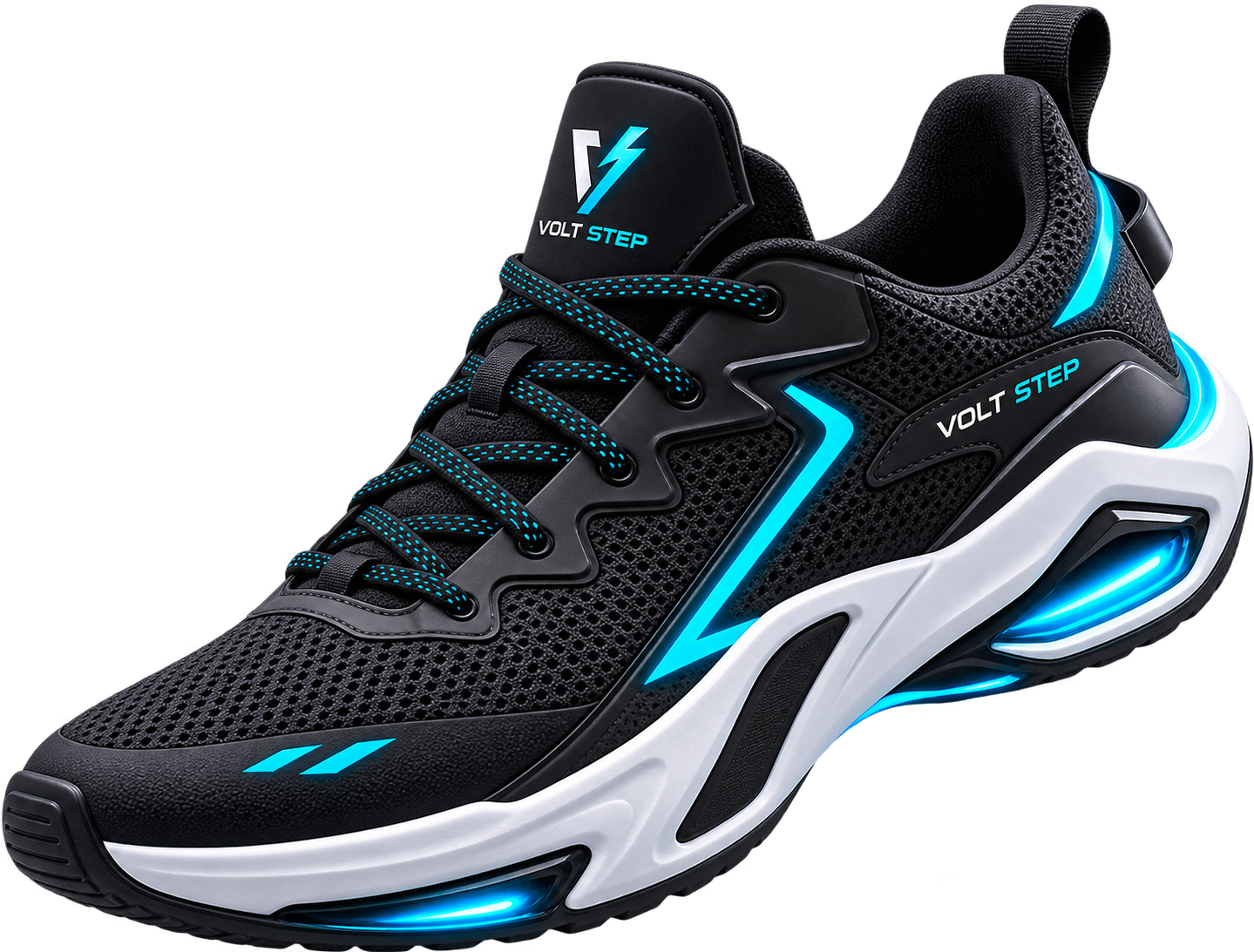
The sneaker image provides the main visual entrance. .volt-sneaker is positioned absolutely on the right and extends beyond the card with right: -85px and bottom: -28px. Before activation, it is invisible and transformed with translateX(80px), translateY(35px), rotate(-9deg), and scale(.72). When the card becomes active, the image reaches full opacity, moves into position, changes to rotate(-7deg), and scales to its full size.
The sneaker transition runs for .65s with a small .08s delay. A drop-shadow() filter underneath the image helps separate it visually from the dark card surface. For more detail on the transform functions used in this reveal, see the MDN CSS transform documentation.
JavaScript also handles closing the component. A document-level click listener checks whether the clicked element is outside voltCard using contains(). If it is, the script removes the active class and the card returns to its compact circular state.
The responsive layout activates below 700px. The expanded card becomes 92% wide with a maximum width of 420px and grows to 430px high. The copy takes the full width, the heading drops from 38px to 32px, and the sneaker becomes 300px wide while moving closer to the lower-right corner.
Customizing This Interactive Sneaker Product Reveal Card
The existing CSS and HTML expose several useful values that can be changed to fit another sneaker brand or product layout.
- Change the initial
120pxwidth and height to make the circular trigger larger or smaller. - Adjust the active card dimensions from
620px × 290pxfor a different desktop layout. - Replace
#22d3eeand the blue gradient values to match another product color scheme. - Change the
.65scard and sneaker transition durations to speed up or slow down the reveal. - Edit
right: -85px,bottom: -28px, and the330pxsneaker width to reposition the product image. - Adjust the sneaker’s
translateX(80px),translateY(35px), rotation, or.72scale to create a different entrance. - Replace the Volt Step logo and sneaker image URLs with your own assets.
- Edit the kicker, heading, description, and “Explore Sneaker” text to suit another product.
Where to Use This Interactive Sneaker Product Reveal Card
This pattern works well when a product needs to begin as a compact visual element and reveal more information only after the user interacts with it.
- Sneaker and footwear landing pages.
- E-commerce product feature sections.
- Sportswear brand campaign pages.
- New-product launch sections.
- Fashion portfolio projects.
- Interactive product galleries.
- Promotional sections for limited-edition footwear.
The expanding layout keeps the interface compact before interaction while still giving the sneaker artwork plenty of space once opened. For another product-based interaction with selectable variations, the Interactive Matcha Product Switcher Card is a related CodeRipple component.
Frequently Asked Questions
Does the Interactive Sneaker Product Reveal Card use JavaScript?
Yes. JavaScript listens for the trigger click and adds the active class to the product card. It also removes that class when the user clicks anywhere outside the component.
How does the sneaker image animate into view?
The image starts with zero opacity, horizontal and vertical translation, a -9deg rotation, and .72 scale. In the active state, it fades in, returns to zero translation, rotates to -7deg, and scales to 1.
How does the card return to its closed state?
A click listener is attached to the document. The script uses voltCard.contains(e.target) to check whether the click happened inside the component. Clicking outside removes the active class.
Is the sneaker reveal card responsive?
Yes. Below 700px, the active card changes to a taller layout with 92% width, a maximum width of 420px, and 430px height. The copy and sneaker image are also resized and repositioned.
The Interactive Sneaker Product Reveal Card combines a compact trigger, staged CSS transitions, oversized product artwork, responsive styling, and simple class-based JavaScript to create a reusable sneaker showcase.