
3D Fantasy Book Cover Pop-Out Cards
Interactive fantasy book cards with a smooth 3D hover effect that brings the character out of the book cover.

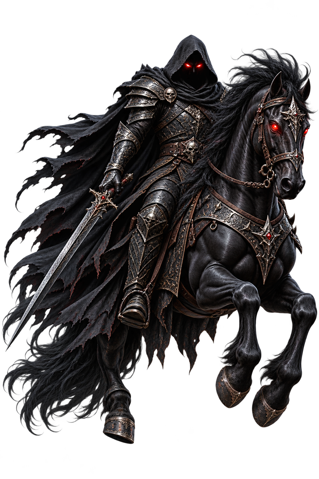


<div class="fantasy-showcase">

  <!-- DARK RIDER -->
  <a href="#" class="fantasy-card-link">

    <div class="fantasy-card">

      <div class="fantasy-cover">
        <img
          src="https://getcoderipple.com/wp-content/uploads/2026/09/ChatGPT-Image-Sep-7-2026-05_36_44-PM.png"
          alt="The Dark Rider book cover"
        />
      </div>

      <img
        src="https://getcoderipple.com/wp-content/uploads/2026/09/ChatGPT-Image-Sep-7-2026-05_41_03-PM.png"
        class="fantasy-character"
        alt="Dark Rider character"
      />

    </div>

  </a>


  <!-- FORCE MAGE -->
  <a href="#" class="fantasy-card-link">

    <div class="fantasy-card">

      <div class="fantasy-cover">
        <img
          src="https://getcoderipple.com/wp-content/uploads/2026/09/ChatGPT-Image-Sep-7-2026-05_42_23-PM.png"
          alt="Force Mage book cover"
        />
      </div>

      <img
        src="https://getcoderipple.com/wp-content/uploads/2026/09/ChatGPT-Image-Sep-7-2026-05_43_54-PM.png"
        class="fantasy-character"
        alt="Force Mage character"
      />

    </div>

  </a>

</div>.fantasy-showcase{
display:flex;
gap:90px;
flex-wrap:wrap;
align-items:center;
justify-content:center;
width:100%;
min-height:520px;
padding:120px 40px 70px;
overflow:visible;
}
.fantasy-card-link{
display:block;
text-decoration:none;
perspective:1200px;
}
.fantasy-card{
position:relative;
width:220px;
height:320px;
overflow:visible;
transform-style:preserve-3d;
}
.fantasy-cover{
position:absolute;
inset:0;
z-index:1;
overflow:hidden;
border-radius:7px;
transform-origin:50% 100%;
transform:rotateX(0deg) translateY(0);
box-shadow:0 18px 30px rgba(0,0,0,.28);
transition:
transform .55s cubic-bezier(.22,.9,.34,1),
box-shadow .55s ease;
will-change:transform;
}
.fantasy-cover img{
width:100%;
height:100%;
display:block;
object-fit:cover;
}
.fantasy-character{
position:absolute;
left:-10%;
top:-8%;
width:120%;
height:108%;
object-fit:contain;
z-index:2;
opacity:0;
transform:
translateY(38px)
scale(.78);
transform-origin:50% 100%;
pointer-events:none;
filter:
drop-shadow(0 18px 16px rgba(0,0,0,.35));
transition:
opacity .25s ease,
transform .55s cubic-bezier(.22,.9,.34,1),
filter .55s ease;
will-change:transform, opacity;
}
.fantasy-card-link:hover .fantasy-cover,
.fantasy-card.is-active .fantasy-cover{
transform:
rotateX(24deg)
translateY(10px)
scale(.98);
box-shadow:
0 45px 35px -22px rgba(0,0,0,.45);
}
.fantasy-card-link:hover .fantasy-character,
.fantasy-card.is-active .fantasy-character{
opacity:1;
transform:
translateY(-42px)
scale(1.06);
filter:
drop-shadow(0 25px 18px rgba(0,0,0,.42));
}
@media (prefers-reduced-motion:reduce){
.fantasy-cover,
.fantasy-character{
transition:none;
}
}
@media (max-width:560px){
.fantasy-showcase{
gap:70px;
}
.fantasy-card{
width:180px;
height:262px;
}
}document.addEventListener('DOMContentLoaded', function() {
var links = document.querySelectorAll('.fantasy-card-link');
var touchDevice = window.matchMedia(
'(hover: none), (pointer: coarse)'
).matches;
if (touchDevice) {
links.forEach(function(link) {
var card = link.querySelector('.fantasy-card');
link.addEventListener('click', function(e) {
var active = card.classList.contains('is-active');
document
.querySelectorAll('.fantasy-card.is-active')
.forEach(function(item) {
if (item !== card) {
item.classList.remove('is-active');
}
});
if (!active) {
e.preventDefault();
card.classList.add('is-active');
}
});
});
document.addEventListener('click', function(e) {
if (!e.target.closest('.fantasy-card-link')) {
document
.querySelectorAll('.fantasy-card.is-active')
.forEach(function(card) {
card.classList.remove('is-active');
});
}
});
}
});How These 3D Fantasy Book Cover Pop-Out Cards Work
The 3D Fantasy Book Cover Pop-Out Cards use layered book artwork, CSS transforms, and a small amount of JavaScript to create a character-reveal effect. The published component contains two examples: The Dark Rider and Force Mage. Each card uses one image for the book cover and a separate character image that appears to rise out of the cover during interaction.
The outer .fantasy-showcase uses Flexbox to place the cards side by side with a 90px gap. flex-wrap: wrap allows the cards to move onto another row when space becomes limited, while justify-content: center keeps the layout centered. The showcase also uses generous top padding because the characters move above the normal book-cover area during the reveal.
Each item is wrapped in .fantasy-card-link, which applies perspective: 1200px. That perspective is important because the book cover rotates around the X axis during interaction. The inner .fantasy-card measures 220px by 320px on larger screens and uses transform-style: preserve-3d so the layered visual can retain its 3D presentation.
The .fantasy-cover fills the complete card using position: absolute and inset: 0. Its transform-origin is set to 50% 100%, placing the transformation origin at the bottom center of the cover. In its resting state, the cover has no rotation or vertical movement.
When the link is hovered, the cover changes to rotateX(24deg) translateY(10px) scale(.98). Because the perspective is applied by the parent link, the X-axis rotation makes the book appear to tilt backward rather than simply becoming smaller. Its shadow also changes from a relatively compact 0 18px 30px shadow to a deeper shadow positioned farther below the card. For more detail on the property controlling this depth effect, see the MDN CSS perspective documentation.
The character image is positioned separately above the cover layer with z-index: 2. It extends beyond the card using left: -10%, top: -8%, width: 120%, and height: 108%. object-fit: contain keeps the complete character visible within those dimensions.
In the resting state, .fantasy-character has opacity: 0 and uses translateY(38px) scale(.78). This means the character begins lower and smaller than its revealed position. On hover, opacity changes to 1, the character moves upward with translateY(-42px), and its scale increases to 1.06. The result is a character that appears to emerge from the tilted book cover.
Both the cover and character use .55s transform transitions with cubic-bezier(.22,.9,.34,1). The character opacity changes more quickly at .25s, helping it become visible while the longer movement is still taking place. A drop-shadow() filter adds separation between the character artwork and the cover beneath it.
JavaScript is included specifically for touch-oriented devices. window.matchMedia('(hover: none), (pointer: coarse)') checks whether the interface is likely being used without normal mouse hover support. On those devices, tapping a card adds the is-active class, which activates the same CSS states used by hover.
The script also keeps only one card active at a time. Before activating a newly tapped card, it removes is-active from any other open card. Tapping outside .fantasy-card-link closes the active card. If the user taps an already active card again, the normal link behavior is allowed instead of preventing the click.
The component also respects reduced-motion preferences. Inside @media (prefers-reduced-motion: reduce), transitions on the cover and character are disabled.
Customizing These 3D Fantasy Book Cover Pop-Out Cards
The existing styles provide several useful values for adapting the cards to different books, characters, or layouts.
- Change the desktop card dimensions from
220px × 320pxto match another cover ratio. - Replace the book-cover and character image sources while keeping the two-layer structure.
- Adjust
rotateX(24deg)to make the cover tilt more or less during interaction. - Change
translateY(-42px)orscale(1.06)to control how far the character rises out of the cover. - Edit
left: -10%,top: -8%, andwidth: 120%to fit character artwork with different proportions. - Change the
.55stransition duration orcubic-bezier(.22,.9,.34,1)timing curve. - Adjust the
90pxdesktop gap or70pxmobile gap to change spacing between cards. - Modify the mobile dimensions of
180px × 262pxinside themax-width: 560pxmedia query.
Where to Use These 3D Fantasy Book Cover Pop-Out Cards
The layered reveal works especially well when cover artwork and a separate character illustration can be combined into one interactive presentation.
- Fantasy novel showcase pages.
- Author or publisher websites.
- Book launch landing pages.
- Character introduction sections.
- Game or graphic-novel galleries.
- Digital library interfaces featuring illustrated covers.
- Portfolio projects focused on cover art or character design.
Because the same reveal works through hover on desktop and the is-active class on touch devices, the interaction remains usable across different input types. For another card design based around strong 3D hover movement, try the 3D Hover Monster Cards component.
Frequently Asked Questions
Do these fantasy book cards use JavaScript?
Yes. CSS handles the visual animation, while JavaScript adds touch-device support. It detects coarse or non-hover input and toggles the is-active class when a card is tapped.
How does the character appear to come out of the book?
The cover tilts backward with rotateX(24deg), while the separate character image fades in, moves from translateY(38px) to translateY(-42px), and grows from .78 to 1.06 scale.
Can more fantasy book cards be added to the layout?
Yes. The showcase uses Flexbox with flex-wrap: wrap, so additional cards following the same HTML structure can flow onto new rows when the available width becomes limited.
Does the component support reduced-motion preferences?
Yes. A prefers-reduced-motion: reduce media query removes the transitions from both .fantasy-cover and .fantasy-character, avoiding animated movement for users who request reduced motion.
These 3D Fantasy Book Cover Pop-Out Cards combine layered artwork, perspective transforms, responsive sizing, hover interaction, and touch-friendly class toggling to create a reusable book and character presentation.