
3D Headphone Audio Reveal Card
An interactive neon audio card with a morphing logo, animated equalizer, headphone pop-out and smooth 3D mouse tilt.
NEON PULSE
Feel every beat with powerful sound, deep bass and futuristic comfort.
Listen Now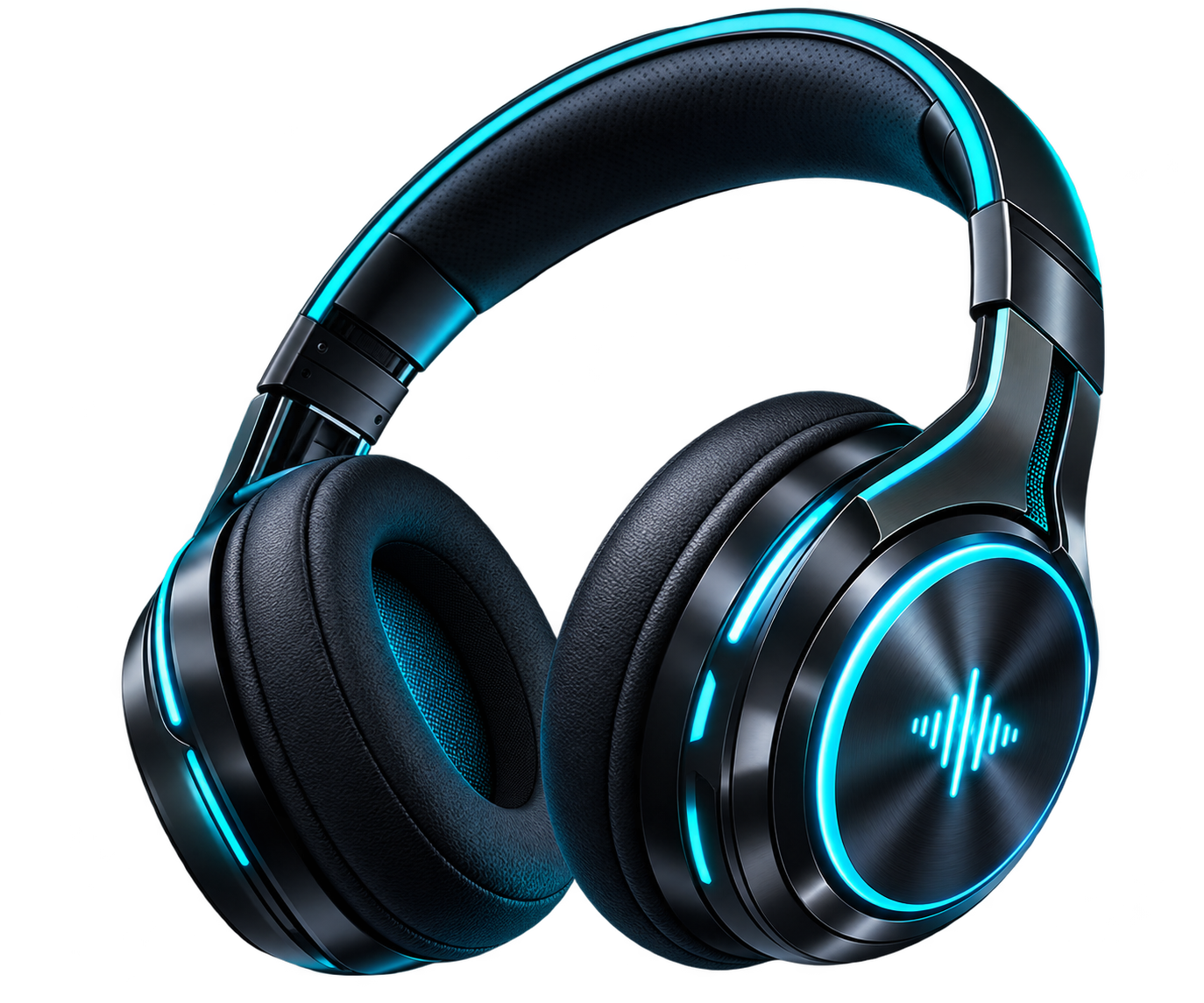
<div class="audio-stage">

  <div class="audio-product-card" id="audioCard">

    <button
      class="audio-trigger"
      id="audioTrigger"
      aria-label="Open Neon Pulse card"
    >
      <img
        src="https://getcoderipple.com/wp-content/uploads/2026/09/Audio-Pulse-Logo.png"
        alt="Neon Pulse audio logo"
      >
    </button>

    <div class="audio-content">

      <div class="audio-copy">

        <span class="audio-kicker">
          IMMERSIVE SOUND
        </span>

        <h2>NEON PULSE</h2>

        <p>
          Feel every beat with powerful sound,
          deep bass and futuristic comfort.
        </p>

        <a href="#" class="audio-btn">
          Listen Now
        </a>

      </div>

      <div
        class="audio-equalizer"
        aria-hidden="true"
      >
        <span></span>
        <span></span>
        <span></span>
        <span></span>
        <span></span>
        <span></span>
        <span></span>
        <span></span>
        <span></span>
      </div>

      <img
        src="https://getcoderipple.com/wp-content/uploads/2026/09/Neon-Headphone.png"
        class="audio-headphones"
        alt="Futuristic black and cyan neon headphones"
      >

    </div>

  </div>

</div>.audio-stage{
width:100%;
min-height:620px;
display:flex;
align-items:center;
justify-content:center;
padding:140px 60px;
background:
radial-gradient(
circle at 65% 50%,
rgba(34,211,238,.09),
transparent 32%
),
#070d19;
overflow:visible;
}
.audio-product-card{
position:relative;
width:125px;
height:125px;
border-radius:50%;
background:
linear-gradient(
135deg,
rgba(12,21,37,.96),
rgba(16,15,38,.96)
);
border:1px solid rgba(34,211,238,.32);
box-shadow:
0 20px 50px rgba(0,0,0,.5),
0 0 35px rgba(34,211,238,.12);
overflow:visible;
transform-style:preserve-3d;
transition:
width .7s cubic-bezier(.22,.9,.34,1),
height .7s cubic-bezier(.22,.9,.34,1),
border-radius .6s ease,
box-shadow .6s ease,
border-color .6s ease,
transform .15s ease;
}
.audio-product-card::before{
content:"";
position:absolute;
inset:-2px;
border-radius:inherit;
background:
linear-gradient(
120deg,
rgba(34,211,238,.4),
transparent 35%,
transparent 65%,
rgba(168,85,247,.35)
);
opacity:0;
filter:blur(16px);
z-index:-1;
transition:opacity .5s ease;
}
.audio-trigger{
position:absolute;
inset:0;
width:125px;
height:125px;
padding:0;
border:0;
border-radius:50%;
background:transparent;
cursor:pointer;
z-index:10;
filter:
drop-shadow(
0 0 15px rgba(34,211,238,.25)
);
transition:
opacity .3s ease,
transform .5s cubic-bezier(.22,.9,.34,1);
}
.audio-trigger img{
display:block;
width:100%;
height:100%;
object-fit:contain;
}
.audio-trigger:hover{
transform:scale(1.06);
}
.audio-content{
position:absolute;
inset:0;
display:flex;
align-items:center;
opacity:0;
pointer-events:none;
transition:
opacity .35s ease .2s;
}
.audio-copy{
position:relative;
z-index:4;
width:47%;
padding-left:46px;
opacity:0;
transform:
translateX(-30px)
translateZ(25px);
transition:
opacity .4s ease .3s,
transform .55s cubic-bezier(.22,.9,.34,1) .25s;
}
.audio-kicker{
display:inline-block;
margin-bottom:10px;
color:#22d3ee;
font-size:11px;
font-weight:800;
letter-spacing:2px;
}
.audio-copy h2{
margin:0 0 13px;
color:#ffffff;
font-size:40px;
line-height:1;
text-shadow:
0 0 24px rgba(34,211,238,.14);
}
.audio-copy p{
max-width:260px;
margin:0 0 21px;
color:#aab4c8;
font-size:14px;
line-height:1.65;
}
.audio-btn{
display:inline-flex;
align-items:center;
justify-content:center;
min-height:43px;
padding:0 20px;
border:1px solid rgba(34,211,238,.5);
border-radius:999px;
background:
linear-gradient(
135deg,
rgba(34,211,238,.2),
rgba(168,85,247,.18)
);
color:#ffffff;
font-size:13px;
font-weight:700;
text-decoration:none !important;
border-bottom:
1px solid rgba(34,211,238,.5) !important;
box-shadow:
inset 0 0 18px rgba(34,211,238,.05);
transition:
transform .2s ease,
border-color .2s ease,
box-shadow .2s ease;
}
.audio-btn:hover{
color:#ffffff;
transform:translateY(-2px);
border-color:#22d3ee !important;
box-shadow:
0 0 22px rgba(34,211,238,.22);
}
.audio-equalizer{
position:absolute;
right:245px;
bottom:35px;
height:72px;
display:flex;
align-items:flex-end;
gap:5px;
z-index:1;
opacity:0;
transform:
translateY(20px)
scale(.8);
transition:
opacity .4s ease .35s,
transform .5s ease .3s;
}
.audio-equalizer span{
width:5px;
height:18px;
border-radius:10px;
background:
linear-gradient(
to top,
#a855f7,
#22d3ee
);
box-shadow:
0 0 12px rgba(34,211,238,.45);
transform-origin:bottom;
animation:
audioBars .75s ease-in-out infinite alternate;
animation-play-state:paused;
}
.audio-equalizer span:nth-child(2){
animation-delay:-.2s;
}
.audio-equalizer span:nth-child(3){
animation-delay:-.45s;
}
.audio-equalizer span:nth-child(4){
animation-delay:-.1s;
}
.audio-equalizer span:nth-child(5){
animation-delay:-.55s;
}
.audio-equalizer span:nth-child(6){
animation-delay:-.3s;
}
.audio-equalizer span:nth-child(7){
animation-delay:-.65s;
}
.audio-equalizer span:nth-child(8){
animation-delay:-.15s;
}
.audio-equalizer span:nth-child(9){
animation-delay:-.4s;
}
@keyframes audioBars{
0%{
height:12px;
}
50%{
height:55px;
}
100%{
height:28px;
}
}
.audio-headphones{
position:absolute;
right:-105px;
bottom:-70px;
width:390px;
max-width:none;
z-index:3;
opacity:0;
transform:
translateX(110px)
translateY(45px)
rotate(12deg)
scale(.65);
transform-origin:center;
filter:
drop-shadow(
0 35px 28px rgba(0,0,0,.55)
)
drop-shadow(
0 0 18px rgba(34,211,238,.12)
);
pointer-events:none;
transition:
opacity .35s ease .15s,
transform .75s cubic-bezier(.18,.9,.3,1.15) .08s,
filter .5s ease;
}
.audio-product-card.active{
width:660px;
height:310px;
border-radius:30px;
border-color:rgba(34,211,238,.45);
box-shadow:
0 35px 80px rgba(0,0,0,.55),
0 0 50px rgba(34,211,238,.12),
0 0 75px rgba(168,85,247,.07);
}
.audio-product-card.active::before{
opacity:1;
}
.audio-product-card.active .audio-trigger{
opacity:0;
transform:
scale(.4)
rotate(-25deg);
pointer-events:none;
}
.audio-product-card.active .audio-content{
opacity:1;
pointer-events:auto;
}
.audio-product-card.active .audio-copy{
opacity:1;
transform:
translateX(0)
translateZ(25px);
}
.audio-product-card.active .audio-headphones{
opacity:1;
transform:
translateX(0)
translateY(0)
rotate(-7deg)
scale(1);
}
.audio-product-card.active .audio-equalizer{
opacity:.55;
transform:
translateY(0)
scale(1);
}
.audio-product-card.active .audio-equalizer span{
animation-play-state:running;
}
@media(max-width:760px){
.audio-stage{
min-height:720px;
padding:140px 20px;
}
.audio-product-card.active{
width:92%;
max-width:430px;
height:470px;
}
.audio-copy{
width:100%;
padding:
38px
30px
0;
align-self:flex-start;
}
.audio-copy h2{
font-size:34px;
}
.audio-headphones{
right:-35px;
bottom:-75px;
width:330px;
}
.audio-equalizer{
right:auto;
left:32px;
bottom:35px;
}
}document.addEventListener(
'DOMContentLoaded',
function() {
var audioCard =
document.getElementById('audioCard');
var audioTrigger =
document.getElementById('audioTrigger');
if (audioCard) {
if (audioTrigger) {
audioTrigger.addEventListener(
'click',
function(e) {
e.preventDefault();
audioCard.classList.add('active');
}
);
}
document.addEventListener(
'click',
function(e) {
if (!audioCard.contains(e.target)) {
audioCard.classList.remove('active');
audioCard.style.transform =
'rotateX(0deg) rotateY(0deg)';
}
}
);
audioCard.addEventListener(
'mousemove',
function(e) {
if (!audioCard.classList.contains('active')) {
return;
}
var rect =
audioCard.getBoundingClientRect();
var mouseX =
e.clientX - rect.left;
var mouseY =
e.clientY - rect.top;
var centerX =
rect.width / 2;
var centerY =
rect.height / 2;
var rotateY =
((mouseX - centerX) / centerX) * 5;
var rotateX =
((centerY - mouseY) / centerY) * 4;
audioCard.style.transform =
'perspective(1000px) rotateX(' +
rotateX +
'deg) rotateY(' +
rotateY +
'deg)';
}
);
audioCard.addEventListener(
'mouseleave',
function() {
audioCard.style.transform =
'perspective(1000px) rotateX(0deg) rotateY(0deg)';
}
);
}
}
);How This 3D Headphone Audio Reveal Card Works
The 3D Headphone Audio Reveal Card begins as a compact circular control instead of showing the complete product panel. The main .audio-product-card starts at 125px by 125px with a circular border-radius: 50%, a dark gradient background, a cyan border, and layered shadows. Inside it, the .audio-trigger button fills the same circular area and displays the Neon Pulse audio logo.
The trigger has a small hover interaction that scales it to 1.06. When it is clicked, JavaScript adds the active class to the main card. That class expands the component to 660px wide and 310px high, changes the border radius to 30px, strengthens the cyan border, and adds larger cyan and purple shadows around the panel.
The card expansion uses separate CSS transitions for width, height, border radius, shadow, border color, and transform. Width and height animate over .7s with a custom cubic-bezier curve, while the border radius and shadow use .6s transitions. A ::before pseudo-element also fades in during the active state. It uses a cyan-to-purple linear gradient with a 16px blur to create the glow around the expanded card.
As the card opens, the circular trigger fades out, scales down to .4, and rotates by -25deg. At the same time, .audio-content becomes visible after a short delay. The copy area begins with zero opacity and a translateX(-30px) transform, then slides into place while keeping a translateZ(25px) value for additional depth.
The text section contains the “IMMERSIVE SOUND” kicker, the “NEON PULSE” heading, a short product description, and a “Listen Now” button. The button uses a pill-shaped border radius, a translucent cyan and purple gradient, and a small upward translation on hover.
The headphone image provides the strongest reveal motion. Before activation, .audio-headphones is positioned off to the right with translateX(110px), translateY(45px), rotate(12deg), and scale(.65). When the active class is applied, it moves into view, rotates to -7deg, and scales to its full size. The image is 390px wide on desktop and extends beyond the card edges to create a layered product-display effect.
A nine-bar equalizer appears near the lower-right area of the panel. Each bar uses the audioBars keyframes, which change its height from 12px to 55px and then 28px. Different negative animation delays prevent all bars from moving in sync. The animation is paused by default and only starts when the card becomes active.
JavaScript also adds a pointer-controlled 3D tilt. While the panel is active, the mousemove handler reads the card dimensions with getBoundingClientRect() and compares the pointer coordinates with the card center. Horizontal movement produces up to approximately five degrees of Y rotation, while vertical movement produces around four degrees of X rotation. The final transform combines those values with perspective(1000px).
Moving the pointer away resets the rotation, while clicking outside the component removes the active class and restores the card transform. The script uses classList.add() and classList.remove() for this state control. For more detail on this API, see the MDN classList documentation.
The responsive rules activate below 760px. The expanded card becomes 92% wide with a maximum width of 430px and a height of 470px. The copy moves toward the top, the heading drops to 34px, the headphones become 330px wide, and the equalizer moves to the lower-left area.
Customizing This 3D Headphone Audio Reveal Card
The component can be adapted by changing the existing dimensions, colors, timing values, text, and artwork without changing its overall interaction pattern.
- Change the closed control size by editing the
125pxwidth and height used by.audio-product-cardand.audio-trigger. - Adjust the expanded desktop size from
660px × 310pxin.audio-product-card.active. - Replace the cyan
#22d3eeand purple#a855f7values to create a different visual theme. - Modify the
.7scard expansion and.75sheadphone reveal timing to make the interaction faster or slower. - Change the
390pxheadphone width or its translation, rotation, and scale values to alter the product entrance. - Edit the equalizer bar heights of
12px,55px, and28pxinside@keyframes audioBars. - Adjust the JavaScript rotation multipliers of
5and4to increase or reduce the 3D tilt strength. - Replace the logo, headphone image, kicker, heading, description, and “Listen Now” text with your own product content.
Where to Use This 3D Headphone Audio Reveal Card
This interaction works best in product-focused sections where a compact control can expand into a more detailed presentation.
- Headphone and audio accessory landing pages.
- Music app or streaming service promotional sections.
- Gaming headset showcases.
- Technology product portfolios.
- E-commerce feature sections for premium audio products.
- Interactive homepage sections where product details should stay compact until requested.
The combination of click-based expansion, animated equalizer bars, product artwork, and pointer tilt makes the card useful for visual product showcases without permanently occupying a large section of the layout. For a related product reveal using fitness statistics instead of audio bars, see the 3D Smartwatch Fitness Dashboard Reveal Card component.
Frequently Asked Questions
Does this headphone reveal card use JavaScript?
Yes. JavaScript opens the card by adding the active class, closes it when the user clicks outside, and calculates the pointer-based 3D rotation while the expanded panel is active.
Does the equalizer animation run all the time?
No. The equalizer bars use animation-play-state: paused by default. They switch to running only when .audio-product-card.active is present.
How is the headphone image revealed?
The image starts with reduced opacity, a right and downward translation, a 12-degree rotation, and .65 scale. In the active state, it fades in, moves into position, rotates to -7deg, and scales to 1.
Is the component responsive on mobile screens?
Yes. Below 760px, the expanded card switches to a taller layout with a maximum width of 430px. The text remains near the top while the headphone image and equalizer are repositioned lower in the card.
The 3D Headphone Audio Reveal Card combines staged CSS transitions, an animated equalizer, oversized product artwork, responsive styling, and JavaScript-controlled perspective movement in a compact interactive component.