

Animated Underline Navbar
Create an Animated Underline Navbar with cyan-to-purple gradient lines that expand beneath links using CSS pseudo-elements, scale transforms, transition timing, and a flexible navigation layout.

Create an Animated Underline Navbar with cyan-to-purple gradient lines that expand beneath links using CSS pseudo-elements, scale transforms, transition timing, and a flexible navigation layout.
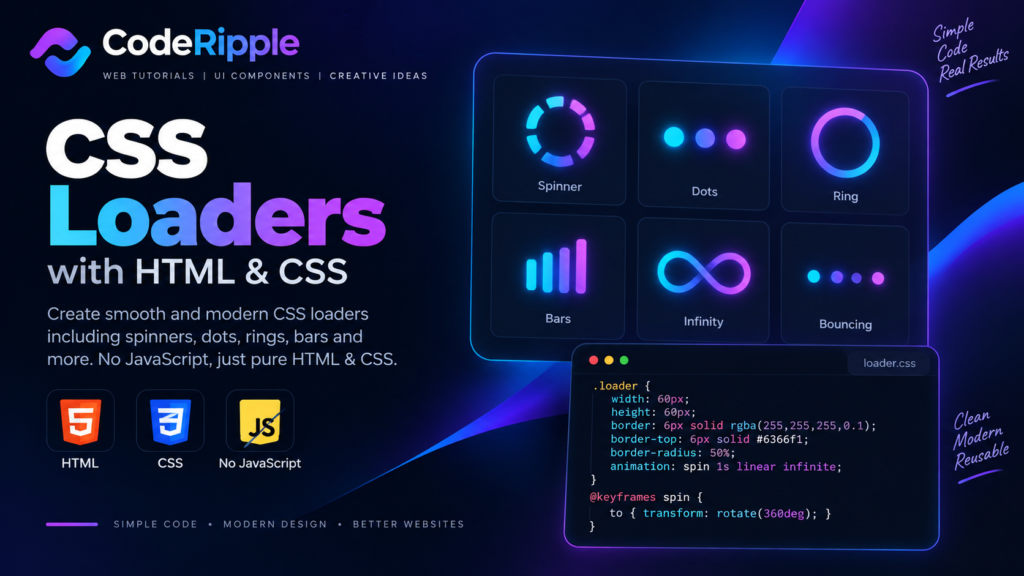
Learn how to create smooth CSS loaders with simple HTML and CSS, including spinners, dots, rings, bars, and other animated loading effects.

Create a CSS-only Progress Bar Loader with a moving cyan, purple, and pink gradient segment, rounded track, glow effect, and continuously repeating transform animation.

Create a CSS-only Hourglass Loader using transparent side borders, a cyan circular outline, and a repeating rotate-and-scale animation with no JavaScript required.

Create a CSS-only Chasing Dots Loader with eight cyan dots, staggered animation delays, changing opacity, and glowing highlights arranged around a circular path.

Create a CSS-only Gradient Spinner Loader with a cyan, purple, and pink conic gradient, masked hollow center, and smooth continuously rotating animation.

Create a CSS-only Square Flip Loader with a cyan-to-purple gradient, rounded corners, soft glow, perspective, and repeating 3D rotations across the X and Y axes.

Create a CSS-only Dual Ring Loader with cyan and purple circular borders rotating in opposite directions at different speeds for a compact indefinite loading indicator.

Create a CSS-only Orbit Loader with a glowing cyan dot moving around a circular path using rotate and translate transforms, with no JavaScript required.

Create a CSS-only Bars Loader with five cyan vertical bars that change height and opacity in a staggered wave animation using simple keyframes and delays.