

Ripple Loader
Create a CSS-only Ripple Loader with two cyan circular rings that scale outward and fade in staggered cycles using simple keyframes and no JavaScript.

Create a CSS-only Ripple Loader with two cyan circular rings that scale outward and fade in staggered cycles using simple keyframes and no JavaScript.

Create a CSS-only Bouncing Dots Loader with three cyan dots that move vertically in a staggered sequence using transforms, alternate animation direction, and simple delays.

Create a CSS-only Spinning Ring Loader with a semi-transparent cyan border, bright cyan and purple segments, and a smooth continuous 360-degree rotation.

Create a CSS-only Pulse Loader with three cyan dots that scale and fade in a staggered sequence using simple keyframes, opacity changes, and animation delays.
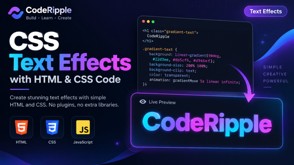
Learn how to create modern CSS text effects with simple HTML and CSS, including gradients, animations, hover effects, shadows, and more.

Create a 3D Shadow Text Effect using HTML and CSS. Layered cyan, blue, and purple shadows create bold depth, while a smooth hover animation makes the text more interactive.

Create a Letter Spacing Hover Effect using HTML and CSS. The text expands smoothly on hover, changes to cyan, and adds a soft glow for a clean interactive typography effect.

Create a Blur Reveal Text Effect using HTML and CSS. The text smoothly transitions from blurred and hidden to sharp and visible, then fades out with a soft animated finish.

Create an Outline Text Hover Effect using HTML and CSS. The text starts with a clean cyan outline, then fills with color and adds a soft glow when hovered.
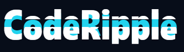
Create a Split Text Hover Effect using HTML and CSS. The top and bottom halves move apart on hover to reveal a colorful center layer with a smooth animated transition.