
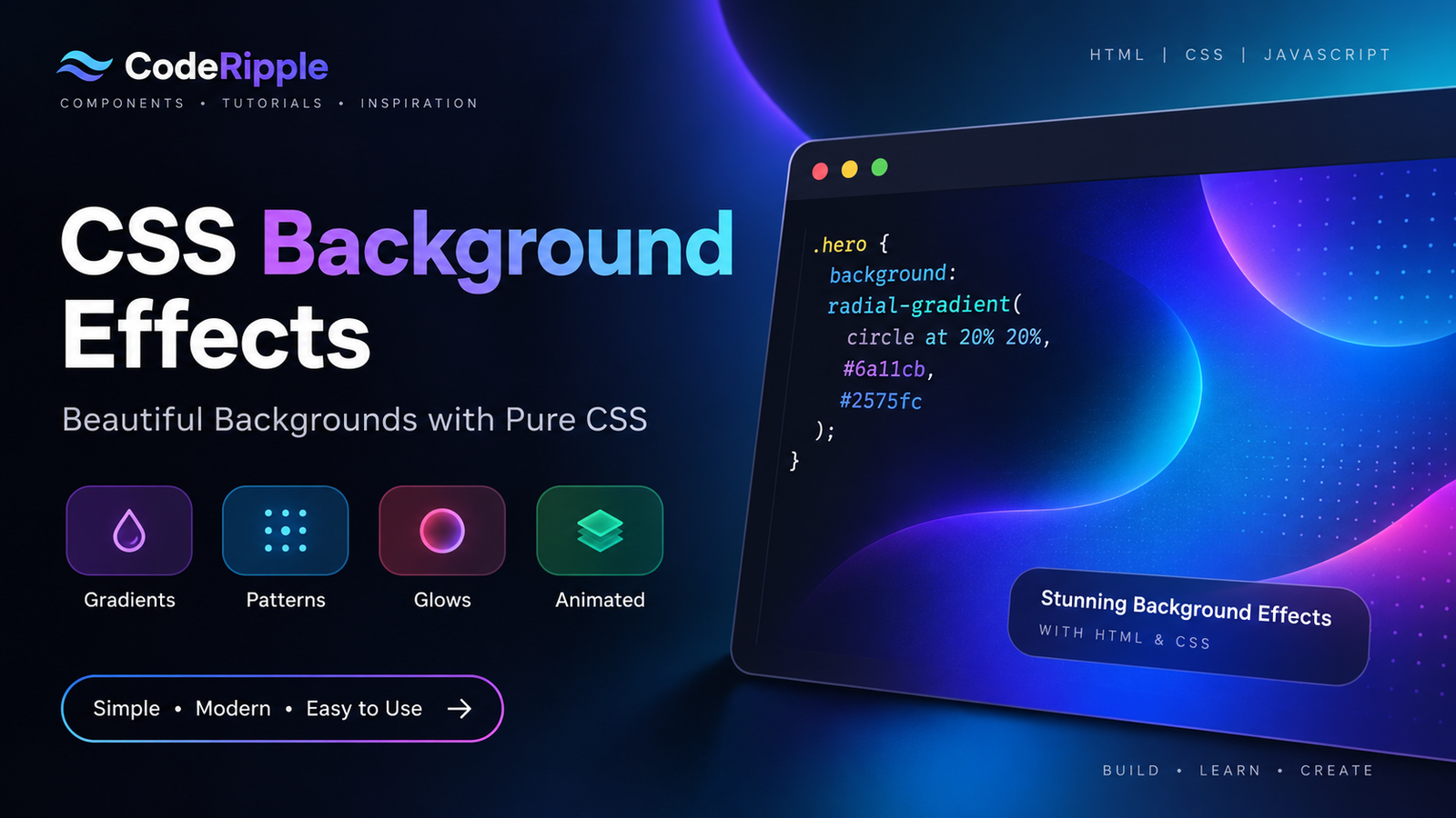
CSS Background Effects can transform simple sections into visually engaging interfaces without relying on heavy images or external libraries. Using gradients, patterns, glows, textures, and subtle animation, you can create responsive backgrounds that add depth while keeping the design lightweight. In this tutorial, we’ll build a modern gradient background and explore more CSS Background Effects you can use for hero sections, landing pages, cards, and other website elements.
What We’re Building
In this tutorial, we’ll create a modern animated gradient background with layered colors, soft glowing areas, and subtle movement. The effect is built with lightweight CSS and adapts smoothly to different screen sizes. These techniques can also be reused to create other CSS Background Effects for hero sections, landing pages, cards, banners, and interactive interface areas.
Live Preview
Here’s the finished background effect in action. Notice how the layered gradients blend together to create depth and visual interest while keeping the content readable. The effect runs entirely with CSS, so no background images or external libraries are required.
CSS Background Effect
Created with layered CSS gradients.
Add the HTML
Start with a simple container that holds the content displayed over the background effect. Keeping the HTML structure minimal allows CSS to handle most of the visual work, while the same markup can easily be reused for different CSS Background Effects, hero sections, banners, or other interface elements.
<div class="gradient-background">

  <div class="gradient-content">
    <h2>CSS Background Effect</h2>
    <p>Created with layered CSS gradients.</p>
  </div>

</div>
Style the Background with CSS
CSS creates the visual effect by combining multiple gradients, background positioning, and animation. Layered colors add depth, while smooth movement keeps the background visually interesting without distracting from the content placed above it. Because these CSS Background Effects are generated directly in the browser, you can easily adjust the colors, animation speed, size, and intensity without editing image assets.
.gradient-background{
  min-height:320px;
  display:flex;
  align-items:center;
  justify-content:center;
  padding:40px;
  border-radius:16px;
  text-align:center;

  background:
    radial-gradient(
      circle at 20% 25%,
      rgba(34,211,238,.45),
      transparent 35%
    ),
    radial-gradient(
      circle at 80% 30%,
      rgba(139,92,246,.50),
      transparent 38%
    ),
    radial-gradient(
      circle at 50% 90%,
      rgba(217,70,239,.30),
      transparent 40%
    ),
    #050914;
}

.gradient-content h2{
  margin:0 0 10px;
  color:#ffffff;
}

.gradient-content p{
  margin:0;
  color:#c7d2e5;
}
How the Background Effect Works
The effect works by layering multiple CSS gradients inside a single background and controlling their size and position independently. CSS animation gradually shifts these layers over time, creating smooth movement and changing color combinations across the section. Since the entire effect is generated with CSS, the background remains scalable, responsive, and easy to customize without using large image files.
Why Use CSS Background Effects?
CSS Background Effects help add depth, movement, and visual interest to a website without relying on large image files or heavy libraries. They are flexible, responsive, and can be customized directly in the stylesheet to match different layouts and design styles.
- Lightweight visuals – Create rich backgrounds without large image assets.
- Easy customization – Change colors, gradients, sizes, and animation speed directly in CSS.
- Responsive design – Effects scale naturally across different screen sizes.
- Reusable styling – Apply the same techniques to multiple sections and components.
- Smooth animation – Add subtle movement without complex JavaScript.
Where You Can Use CSS Background Effects
CSS Background Effects work well in areas where you want to create visual depth or highlight important content without adding heavy graphics. They can be adapted to both full-page layouts and smaller interface sections.
- Hero sections – Create eye-catching backgrounds behind headlines and CTAs.
- Landing pages – Add visual energy to promotional sections.
- Feature sections – Separate important content with distinctive backgrounds.
- Cards and panels – Add subtle gradients, glows, or patterns.
- Portfolio websites – Give project sections a more creative appearance.
- Call-to-action areas – Draw attention to important messages and buttons.
Customizing the Background Effect
You can customize these CSS Background Effects by changing the gradient colors, background size, animation speed, direction, and layer positions. You can also experiment with radial gradients, repeating patterns, blur effects, and different color combinations to match your website’s visual style while keeping the effect lightweight and responsive.
Try It Yourself
Want to experiment with the effect yourself? Open the CodeRipple Playground, paste the HTML and CSS, and try changing the gradient colors, animation speed, background size, or layer positions. You can preview your changes instantly and customize the background to match your own website or project.
Final Thoughts
CSS Background Effects are a simple and flexible way to make websites more visually engaging without relying on heavy image assets or external libraries. By combining gradients, layered backgrounds, and subtle animation, you can create responsive effects that work across many different layouts. Experiment with colors, movement, patterns, and intensity to create a background style that fits your own project.
Explore More CSS Background Effects
Animated Gradient Background
A smooth animated gradient background that adds depth and movement to modern websites without requiring images or external libraries.
Open in Playground →Aurora Background
A soft animated aurora-style background with glowing color layers that create a smooth modern atmosphere using only HTML and CSS.
Open in Playground →Animated Grid Background
A clean moving grid background with subtle depth and motion, built with pure CSS for modern sections, dashboards, and landing pages.
Open in Playground →Dot Pattern Background
A clean dotted background pattern built with pure CSS, ideal for modern landing sections, dashboards, and subtle interface backgrounds.
Open in Playground →Moving Stripes Background
A smooth diagonal stripe background with continuous motion, created with pure CSS for modern sections, banners, and interface backgrounds.
Open in Playground →Radial Glow Background
A modern dark background with layered radial glows that add soft color, depth, and focus without using images or external libraries.
Open in Playground →Floating Blobs Background
A soft animated background with floating blurred color blobs that add depth, movement, and a modern visual style using only HTML and CSS.
Open in Playground →Gradient Wave Background
A layered animated wave background with smooth gradient colors, built with pure CSS for modern hero sections, banners, and interface areas.
Open in Playground →Spotlight Background
A modern dark background with a soft spotlight glow that creates a clear focal point for hero sections, headings, and featured content.
Open in Playground →Geometric Pattern Background
A modern geometric background made with layered CSS shapes and gradients, ideal for hero sections, cards, and dark interface layouts.
Open in Playground →Mesh Gradient Background
A smooth mesh-style gradient background with blended color zones that create a modern layered look using only HTML and CSS.
Open in Playground →Noise Gradient Background
A textured gradient background that combines soft color blending with subtle visual noise for a modern premium look.
Open in Playground →Interactive Tech Orbit with Light Switch
A glowing interactive technology orbit with 3D glass cards, smooth orbital movement and a pull-cord light switch.
Open in Playground →