
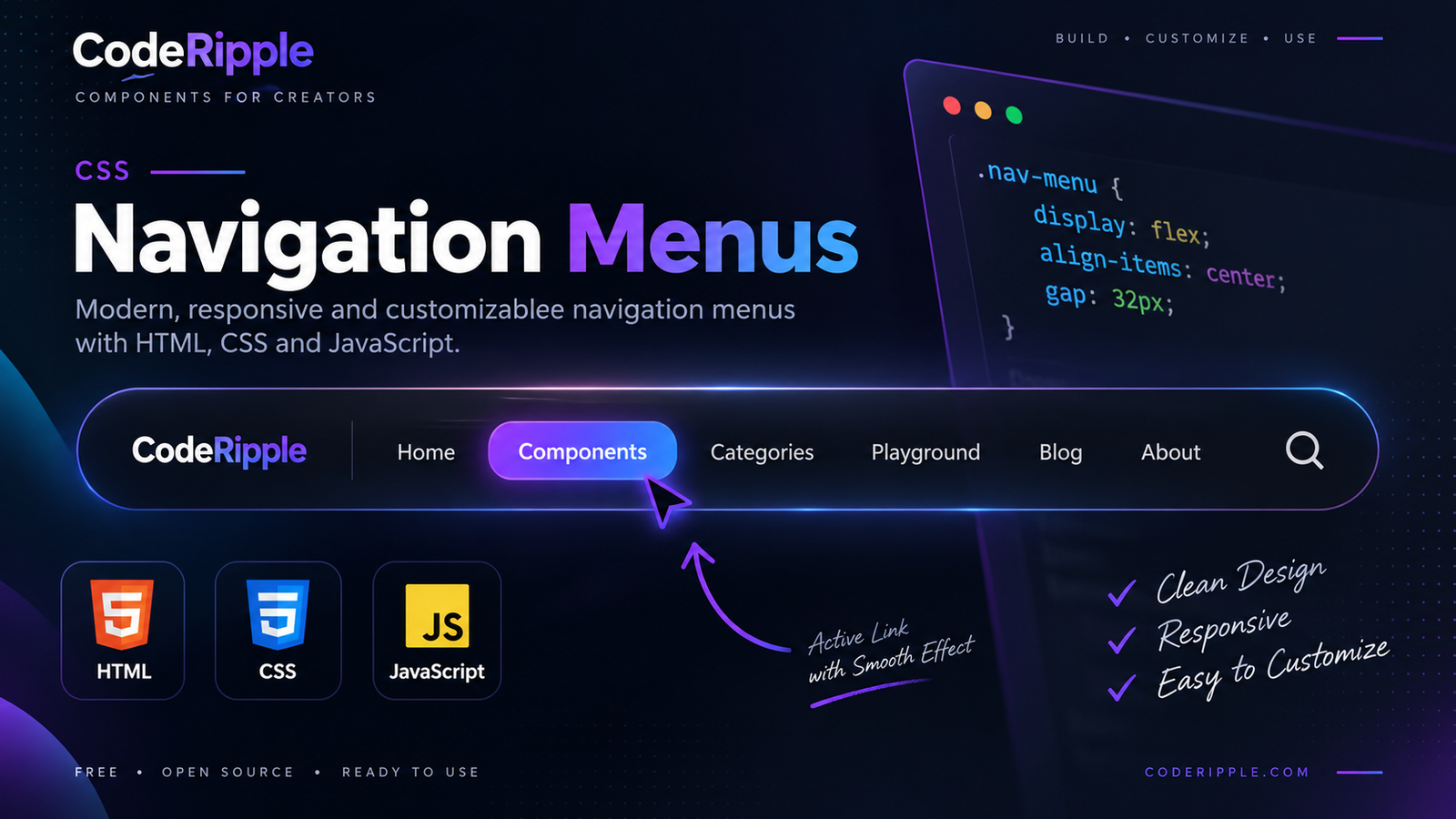
CSS navigation menus help visitors move through a website quickly while keeping important pages and sections easy to access. With HTML, CSS, and JavaScript, navigation can include responsive layouts, hover effects, active states, dropdowns, and interactive mobile controls. In this tutorial, we’ll build a clean navigation menu and explore more CSS navigation menus you can use for headers, dashboards, portfolios, landing pages, and other website interfaces.
What We’re Building with CSS Navigation Menus
In this tutorial, we’ll create a clean and responsive navigation menu with clear links, smooth hover feedback, and an active state that helps users understand their current location. The flexible layout can be customized for different screen sizes and reused across many types of CSS navigation menus, from simple website headers to more interactive navigation interfaces.
Live Preview
Here’s the finished navigation menu in action. Hover over the links to see the visual feedback, then click different items to test the active state. The interaction gives users a clear indication of which navigation item is currently selected.
Live Preview — Hover over the navigation links
Add the HTML
Start by creating the navigation structure with semantic HTML links inside a dedicated menu container. Each link represents a destination within the website, while simple class names make the menu easy to style and control with CSS and JavaScript. This structure can also be reused for different CSS navigation menus without rebuilding the markup from scratch.
<nav class="simple-navbar">
  <a href="#" class="active">Home</a>
  <a href="#">Components</a>
  <a href="#">Playground</a>
  <a href="#">Blog</a>
  <a href="#">About</a>
</nav>
Style CSS Navigation Menus with CSS
CSS controls the layout, spacing, colors, typography, hover states, and active styles of the navigation menu. Flexbox keeps the links aligned in a clean row, while transitions make the hover feedback feel smooth and responsive. These styling techniques can be reused across different CSS navigation menus and adjusted to match the visual style of your website.
.simple-navbar{
  display:flex;
  align-items:center;
  justify-content:center;
  gap:8px;
  flex-wrap:wrap;
  padding:8px;
  background:#0b1423;
  border:1px solid #1c2a40;
  border-radius:12px;
}

.simple-navbar a{
  padding:10px 16px;
  border-radius:8px;
  color:#aab4c8;
  font-size:14px;
  font-weight:600;
  text-decoration:none;
  transition:.25s ease;
}

.simple-navbar a:hover{
  color:#ffffff;
  background:rgba(34,211,238,.10);
}

.simple-navbar a.active{
  color:#ffffff;
  background:linear-gradient(135deg,#0891b2,#7c3aed);
}
Add JavaScript Interaction
JavaScript adds interactive behavior to the form by listening for the submit event and responding to the user’s action. In this example, it prevents the default page refresh and displays a confirmation message after submission. The same approach can later be extended with form validation, error messages, API requests, or other interactive features for more advanced CSS Forms.
document.querySelectorAll('.simple-navbar a').forEach(function(link) {

  link.addEventListener('click', function(e) {

    e.preventDefault();

    document.querySelectorAll('.simple-navbar a').forEach(function(item) {
      item.classList.remove('active');
    });

    this.classList.add('active');

  });

});
How the Navigation Menu Works
The navigation menu combines HTML structure, CSS styling, and JavaScript behavior to create a simple interactive component. HTML defines the links, CSS controls the layout, hover effects, and active styles, while JavaScript updates the selected item when a user clicks a different link. Together, these layers create responsive and reusable CSS navigation menus that can be adapted for many types of websites.
Why Use CSS Navigation Menus?
Well-designed CSS navigation menus make it easier for visitors to understand a website’s structure and move between important pages. Custom styling also gives you control over spacing, colors, hover feedback, active states, and responsive behavior while keeping navigation consistent with the rest of the interface.
- Clear navigation – Help visitors find important pages quickly.
- Consistent design – Match the menu with your website’s visual style.
- Interactive feedback – Use hover and active states to improve usability.
- Responsive layouts – Adapt navigation for desktop, tablet, and mobile screens.
- Reusable structure – Use the same menu pattern across different pages and projects.
Where You Can Use CSS Navigation Menus
CSS navigation menus can be used anywhere users need a clear way to move between pages, sections, or features. Their flexible structure makes them suitable for both simple websites and more complex web interfaces.
- Website headers – Provide access to primary pages and sections.
- Landing pages – Help users jump between important content areas.
- Portfolio websites – Organize projects, services, and contact pages.
- Dashboards – Navigate between tools, reports, and account sections.
- Mobile interfaces – Create compact hamburger or slide-out menus.
- Sidebars – Organize secondary navigation and application features.
Customizing the Navigation Menu
You can customize these CSS navigation menus by changing the colors, spacing, typography, link styles, hover effects, and active states. You can also adjust the layout for different screen sizes or extend the menu with dropdowns, icons, animated indicators, and mobile navigation controls. JavaScript can be used for more advanced interactions such as toggling menus or managing dynamic active states.
Try It Yourself
Want to experiment with the navigation yourself? Open the CodeRipple Playground, paste the HTML, CSS, and JavaScript, and try changing the colors, spacing, hover effects, active styles, or link labels. You can preview your changes instantly and customize the navigation menu to match your own website or project.
Final Thoughts
CSS navigation menus are an essential part of creating websites that feel organized and easy to explore. By combining semantic HTML, responsive CSS, and lightweight JavaScript, you can build navigation that provides clear feedback and adapts to different layouts. Experiment with colors, spacing, animations, active states, and menu styles to create navigation that fits your own project.
Explore More Navigation Components
Animated Underline Navbar
A clean navigation menu with a smooth animated underline on hover. It uses simple HTML and CSS and works well for modern website headers.
Open in Playground →Pill Hover Navbar
A modern navigation menu with smooth pill-shaped hover backgrounds. It uses simple HTML and CSS and works well for clean website headers.
Open in Playground →Sliding Highlight Navbar
A modern navigation menu with a smooth sliding highlight effect on hover. It uses simple HTML and CSS and works well for clean website headers.
Open in Playground →Glassmorphism Navbar
A sleek glass-style navigation bar with blur, transparency, and soft borders. It uses simple HTML and CSS and works well for modern dark interfaces.
Open in Playground →Gradient Border Navbar
A modern navigation bar with a glowing gradient border and smooth hover effects. It uses simple HTML and CSS and fits well in dark interface designs.
Open in Playground →Glow Hover Navbar
A modern navigation menu with a soft neon glow effect on hover. It uses simple HTML and CSS and works especially well on dark interfaces.
Open in Playground →Centered Logo Navbar
A balanced navigation layout with menu links on both sides of a centered logo. It uses simple HTML and CSS and works well for modern brand websites.
Open in Playground →Minimal Icon Navbar
A compact navigation bar that combines simple icons with clean text labels. It uses HTML and CSS and works well for dashboards, tools, and modern web apps.
Open in Playground →Active Link Navbar
A clean navigation menu with a highlighted active link and smooth hover effects. It uses simple HTML and CSS to clearly show the current page.
Open in Playground →Sticky Navbar
A clean sticky navigation bar that stays visible at the top while the page scrolls. It uses simple HTML and CSS with smooth hover effects.
Open in Playground →Hamburger Menu Navbar
A responsive navigation bar with a hamburger menu that opens and closes the navigation links on smaller screens.
Open in Playground →Dropdown Navbar
A clean navigation bar with a dropdown menu for grouped links. It uses HTML, CSS, and a small amount of JavaScript for opening and closing the menu.
Open in Playground →Expandable Sidebar Navigation
A clean responsive sidebar navigation with smooth collapse and expand behavior, grouped menu sections, active states and notification badges.
Open in Playground →Neumorphic Pill Navigation
A smooth pill-style navigation menu with a raised active tab, subtle neumorphic hover effects and responsive behavior.
Open in Playground →Animated Fly-In Navigation Menu
A smooth animated navigation menu with staggered fly-in items, CodeRipple menu links and responsive interaction.
Open in Playground →Radial Social Media Menu
A modern radial social menu with smooth staggered animations, glass-style buttons and a cyan-purple CodeRipple hover effect.
Open in Playground →Floating Neon Navigation Bar
A futuristic floating navigation bar with a glowing active orb, smooth indicator movement, interactive icons and neon hover effects.
Open in Playground →