
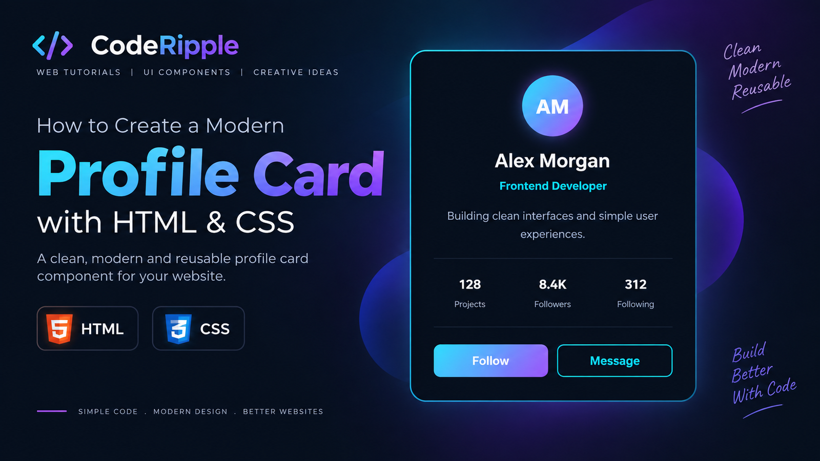
A profile card HTML CSS design is a clean and flexible way to present personal or professional information inside a compact interface. It can include a profile image, name, role, short bio, social stats, and action buttons while staying responsive across different screen sizes. In this tutorial, we’ll build a modern profile card using HTML, CSS, and JavaScript, then explore more profile card designs you can use in portfolios, team pages, dashboards, and personal websites.
What We’re Building: A Profile Card HTML CSS Design
In this tutorial, we’ll create a modern profile card HTML CSS layout that combines an avatar, name, role, short bio, social stats, and action buttons in one compact design. The card uses a dark interface with subtle borders and accent colors, while the responsive structure keeps it clean and usable across different screen sizes.
Live Preview
Here’s the finished profile card in action. It combines the key profile details in a compact, reusable layout while keeping the design clean and easy to scan.
Alex Morgan
Frontend DeveloperBuilding clean interfaces and simple user experiences.
Add the HTML
Start by creating the basic structure of the profile card with semantic HTML. The layout includes a profile image, name, role, short bio, social statistics, and action buttons. Keeping each part inside its own element makes the card easier to style, customize, and reuse across different sections of a website.
<div class="profile-card">

  <div class="profile-avatar">AM</div>

  <h3>Alex Morgan</h3>

  <span class="profile-role">
    Frontend Developer
  </span>

  <p>
    Building clean interfaces and simple user experiences.
  </p>

  <div class="profile-stats">

    <div>
      <strong>128</strong>
      <span>Projects</span>
    </div>

    <div>
      <strong>8.4K</strong>
      <span>Followers</span>
    </div>

    <div>
      <strong>312</strong>
      <span>Following</span>
    </div>

  </div>

  <div class="profile-actions">
    <button>Follow</button>
    <button>Message</button>
  </div>

</div>
Style the Profile Card with CSS
CSS transforms the basic HTML structure into a polished profile card by controlling the layout, spacing, colors, typography, borders, and button styles. Flexbox keeps the profile details and statistics aligned, while rounded corners and subtle visual accents give the card a modern appearance. Responsive styling also helps the component adapt smoothly to smaller screens.
.profile-card{
  width:100%;
  max-width:340px;
  padding:28px;
  box-sizing:border-box;
  text-align:center;
  background:#08111f;
  border:1px solid rgba(34,211,238,.30);
  border-radius:18px;
  color:#fff;
}

.profile-avatar{
  width:64px;
  height:64px;
  display:flex;
  align-items:center;
  justify-content:center;
  margin:0 auto 16px;
  border-radius:50%;
  background:linear-gradient(135deg,#22d3ee,#8b5cf6);
  color:#fff;
  font-size:20px;
  font-weight:800;
  box-shadow:0 0 22px rgba(139,92,246,.28);
}

.profile-card h3{
  margin:0 0 5px;
  color:#fff;
  font-size:22px;
}

.profile-role{
  display:block;
  margin-bottom:16px;
  color:#22d3ee;
  font-size:13px;
  font-weight:700;
}

.profile-card p{
  margin:0 0 22px;
  color:#aab4c8;
  font-size:14px;
  line-height:1.6;
}

.profile-stats{
  display:grid;
  grid-template-columns:repeat(3,1fr);
  gap:10px;
  padding:18px 0;
  border-top:1px solid rgba(255,255,255,.08);
  border-bottom:1px solid rgba(255,255,255,.08);
}

.profile-stats strong,
.profile-stats span{
  display:block;
}

.profile-stats strong{
  margin-bottom:4px;
  color:#fff;
  font-size:16px;
}

.profile-stats span{
  color:#8fa4bd;
  font-size:10px;
}

.profile-actions{
  display:flex;
  gap:10px;
  margin-top:20px;
}

.profile-actions button{
  flex:1;
  padding:10px 14px;
  border:1px solid #22d3ee;
  border-radius:8px;
  background:transparent;
  color:#22d3ee;
  font-weight:700;
  cursor:pointer;
}

.profile-actions button:first-child{
  border:0;
  background:linear-gradient(135deg,#22d3ee,#8b5cf6);
  color:#fff;
}
How the Profile Card Works
The profile card is divided into clearly defined sections, with each element handling a specific piece of information. The avatar creates the main visual focus, while the name, role, and bio establish the user’s identity. The statistics section organizes key numbers in a compact row, and the action buttons provide clear interaction points. CSS brings these elements together with consistent spacing, alignment, colors, and responsive behavior.
Why Use Profile Cards?
Profile cards provide a compact and organized way to present important user information without taking up too much space. They combine identity, supporting details, statistics, and actions into a single reusable component that can fit naturally into many modern interfaces.
- Compact layout – Important profile information stays organized in one place.
- Reusable design – The same card structure can represent different users or team members.
- Clear hierarchy – Avatar, name, role, bio, and stats are easy to scan.
- Responsive structure – The card can adapt to desktop, tablet, and mobile layouts.
- Action focused – Buttons make it easy to add follow, message, contact, or profile actions.
Where You Can Use Profile Cards
A profile card HTML CSS component works well anywhere you need to present personal, professional, or account information in a clear and visually organized format. Their compact structure makes them suitable for both standalone sections and larger card-based layouts.
- Portfolio websites – Introduce designers, developers, or freelancers.
- Team pages – Display employee names, roles, and profile details.
- Social platforms – Show user profiles, followers, and interaction controls.
- Dashboards – Present account or member information in admin interfaces.
- Community websites – Display authors, contributors, or registered members.
Customizing the Profile Card
You can easily customize the profile card by changing the avatar, name, role, bio, statistics, colors, spacing, border radius, and button styles. You can also adjust the card width, typography, and accent colors in the CSS to match your website’s design. For more advanced versions, the buttons can be connected to JavaScript interactions, profile pages, or social actions.
Try It Yourself
Want to customize the card yourself? Open the CodeRipple Playground, paste the HTML and CSS, and experiment with the profile image, colors, spacing, statistics, and button styles. You can preview your changes instantly and adapt the card to match your own portfolio, dashboard, or website.
Final Thoughts
A profile card HTML CSS design is a practical way to present user information in a clean, structured, and visually engaging format. With a simple combination of HTML and CSS, you can create a responsive component that works across portfolios, team pages, dashboards, and community websites. Experiment with different layouts, colors, typography, and actions to create a profile card that fits your own project.
Explore More Profile Cards
Profile Card
A clean modern profile card with an avatar, user details, social stats and action buttons. Copy the HTML and CSS for your own project.
Open in Playground →Hover Lift Card
A modern content card with a smooth lift effect, soft glow and subtle border highlight on hover. Copy the HTML and CSS for your own project.
Open in Playground →Glassmorphism Card
A modern glass-style card with translucent layers, soft blur and subtle glow effects. Copy the HTML and CSS for your own project.
Open in Playground →Pricing Card
A modern pricing card with plan details, feature list and a clear call-to-action button. Copy the HTML and CSS for your own project.
Open in Playground →Product Card
A modern product card with image area, rating, price and a clear add-to-cart action. Copy the HTML and CSS for your own project.
Open in Playground →Testimonial Card
A clean testimonial card with customer feedback, star rating and profile details. Copy the HTML and CSS for your own project.
Open in Playground →Blog Article Card
A modern blog article card with thumbnail area, category label, article details and a read-more link. Copy the HTML and CSS for your own project.
Open in Playground →Feature Card
A clean feature card with a gradient icon, supporting text and a simple action link. Copy the HTML and CSS for your own project.
Open in Playground →Stats Card
A modern statistics card with a main value, growth indicator and progress bar. Copy the HTML and CSS for your own project.
Open in Playground →Notification Card
A clean notification card with an icon, message, timestamp and unread indicator. Copy the HTML and CSS for your own project.
Open in Playground →Team Member Card
A clean team profile card with avatar, role, short bio and social links. Copy the HTML and CSS for your own project.
Open in Playground →Interactive CTA Card
A modern call-to-action card with an icon, short message and animated button. Copy the HTML and CSS for your own project.
Open in Playground →3D Fantasy Book Cover Pop-Out Cards
Interactive fantasy book cards with a smooth 3D hover effect that brings the character out of the book cover.
Open in Playground →Interactive Sneaker Product Reveal Card
A futuristic product card that expands from a circular brand logo into a premium sneaker showcase with smooth motion and pop-out animation.
Open in Playground →3D Headphone Audio Reveal Card
An interactive neon audio card with a morphing logo, animated equalizer, headphone pop-out and smooth 3D mouse tilt.
Open in Playground →3D Smartwatch Fitness Dashboard Reveal Card
An interactive smartwatch fitness card with a glowing dial, animated health stats, product pop-out and smooth 3D reveal.
Open in Playground →Interactive Matcha Product Switcher Card
A premium interactive product card with four matcha variations, smooth image switching, dynamic delivery date and embossed ingredient controls.
Open in Playground →Interactive Travel Destination Slider
A cinematic travel destination slider with animated hero image switching, interactive destination cards, navigation arrows and progress tracking.
Open in Playground →3D Hover Monster Cards
Interactive fantasy cards that tilt toward the floor on hover while unique monster characters rise above them with glowing 3D depth effects.
Open in Playground →